Mobile Design · Redesign · EdTech
A mobile app redesign that makes attendance, scheduling, and student management fast, simple, and school-integrated — from any phone, on the busiest days.
Few taps
To mark full class attendance
One view
For schedules, attendance, and analytics
Always
Synced with school Dataroom
Teachers were using a fragmented tool that made simple tasks feel harder than they needed to be. Taking attendance required multiple taps and screen switches. Schedules weren't editable on mobile. Analytics were buried and hard to read at a glance.
The redesign wasn't about adding features — it was about making the existing ones actually work during the moments teachers need them most: between classes, in the middle of a lesson, or at the start of a busy day.
Taking attendance shouldn't take time away from teaching. I redesigned the attendance flow to bring it front and centre — mark students present or absent in a few taps, with a clear visual overview of who's missing.
Key Design Decision
The attendance screen defaults to "all present" — teachers tap to mark absent, not the other way around. In a class of 30, most students are present most of the time. Designing for the majority case made the common workflow faster, and the exceptions still clear.
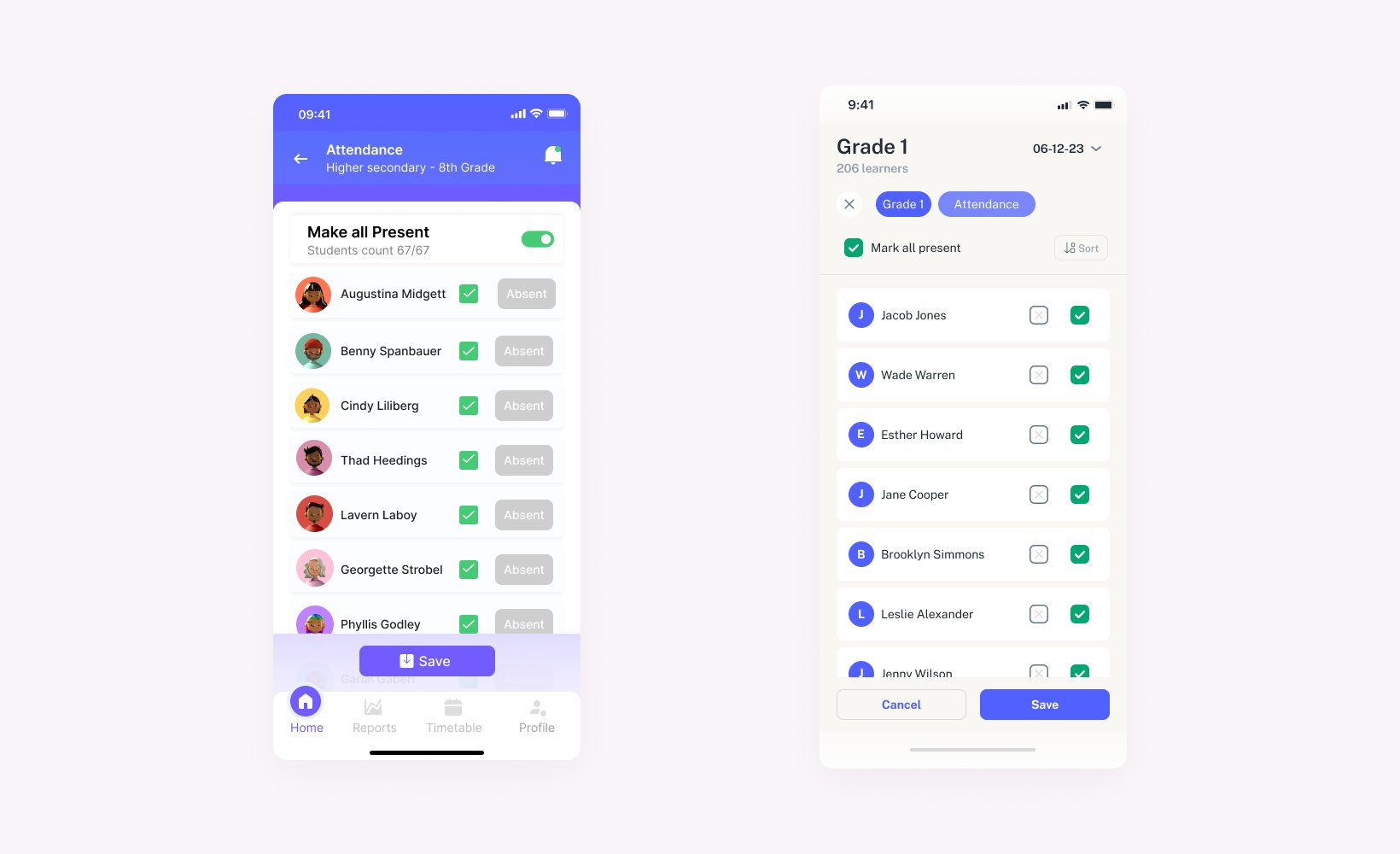
Attendance flow — from class list to submitted in a few taps
Creating and managing class schedules should be quick, not chaotic. The redesigned app makes it easy to set up and adjust weekly timetables — all in one place. Whether it's a recurring class or a last-minute change, teachers can plan their days with clarity and confidence.
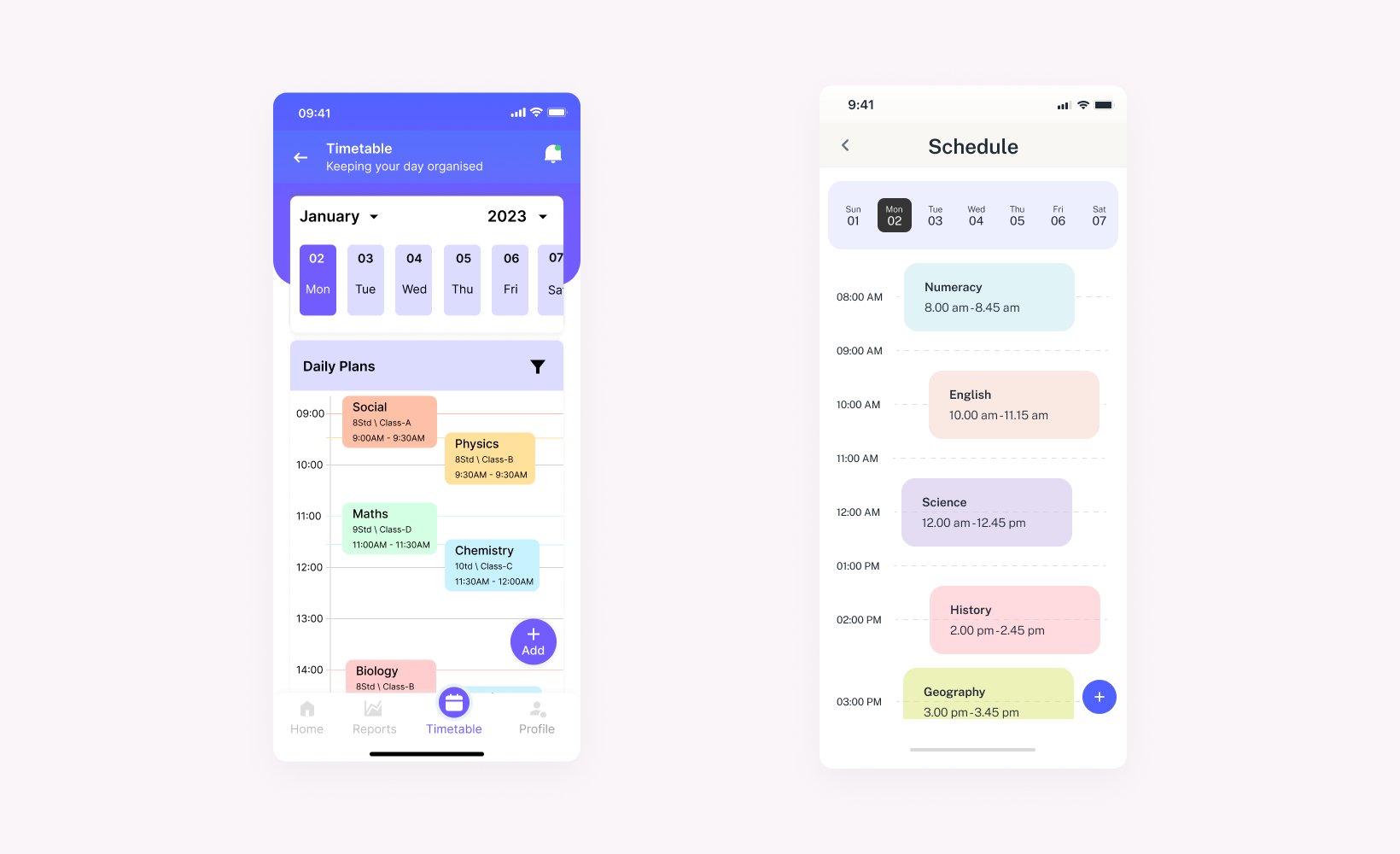
Weekly schedule — set up once, easy to adjust
Teachers shouldn't have to dig for insights. The new analytics view surfaces everything that matters: total students, individual attendance patterns, and indicators of students who may be falling behind. It's a simple, visual way to track class performance and support students more proactively.
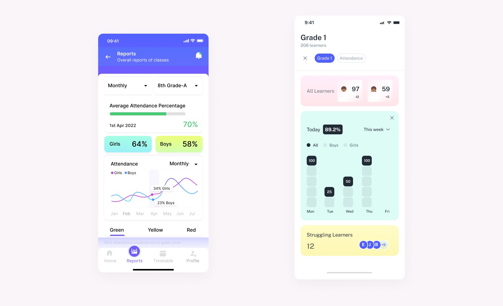
Analytics that surface what matters — without digging for it
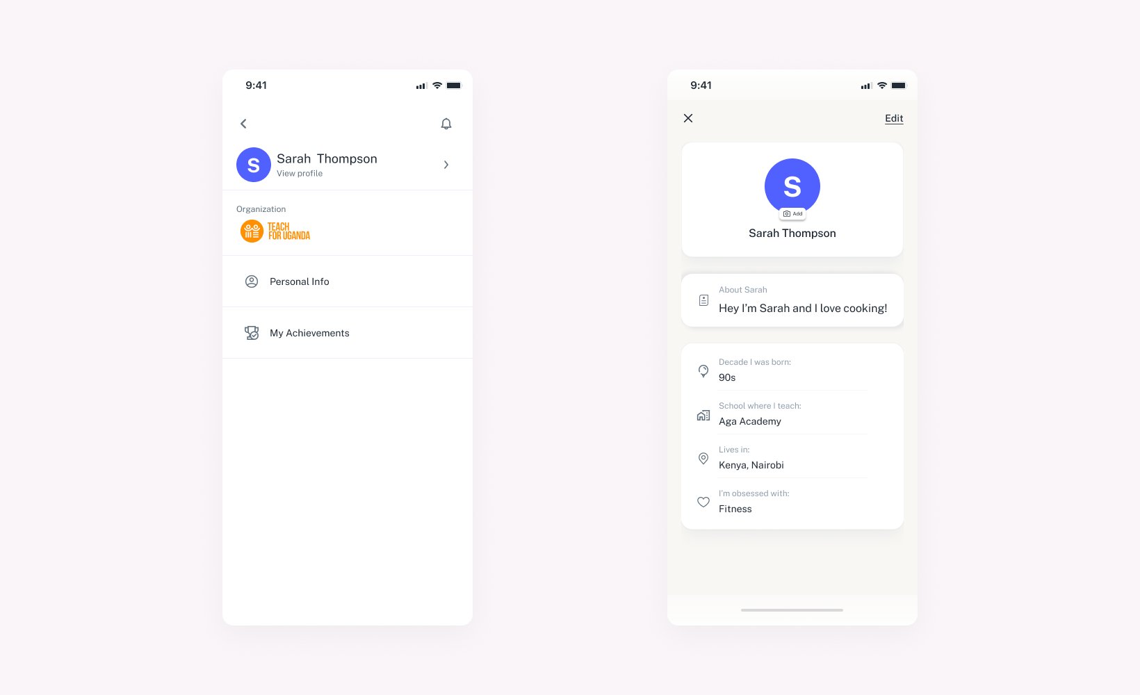
The redesign added a dedicated teacher profile where they can manage personal info, track achievements, and make quick edits — all synced with the school Dataroom. It's a simple way to keep records accurate, up-to-date, and personalised.
Profile — personal, synced, and easy to update

The Teacher's App — every screen working together
The key lesson from this project was that mobile redesigns fail when they try to port a desktop mental model onto a phone screen. Teachers use this app in short bursts — between classes, during breaks, while standing. Every screen had to work for someone with 30 seconds and one hand free.
The default-to-present attendance decision came directly from watching how teachers actually used the old app — most were tapping "present" for 28 out of 30 students every session. Designing for the real pattern, not the edge case, made the biggest difference.
Managing a classroom doesn't have to be a chore. This redesign makes sure it isn't.
All projects
← Back to work