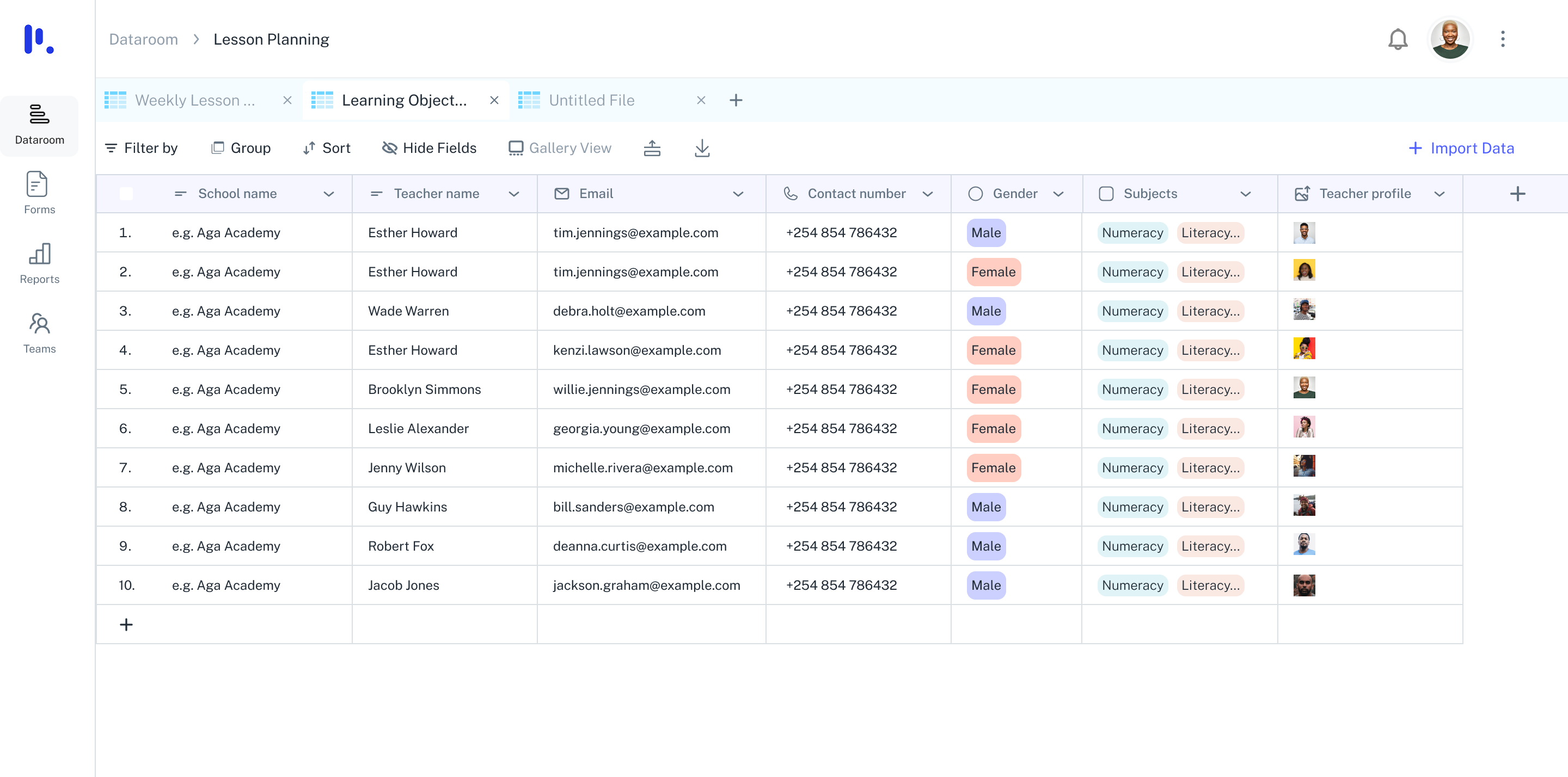
Product Design · Redesign · Collaboration
A redesign that turned a cluttered data entry tool into a flexible, collaborative environment for organising, analysing, and acting on data.
The original Dataroom was functional but fragmented. Users could upload files and create tables, but the experience felt disconnected — collaboration was an afterthought, AI features were buried, and the interface created cognitive overhead instead of reducing it.
Teams were jumping between tools to organise data, invite collaborators, and generate insights. Everything existed, but nothing worked together.
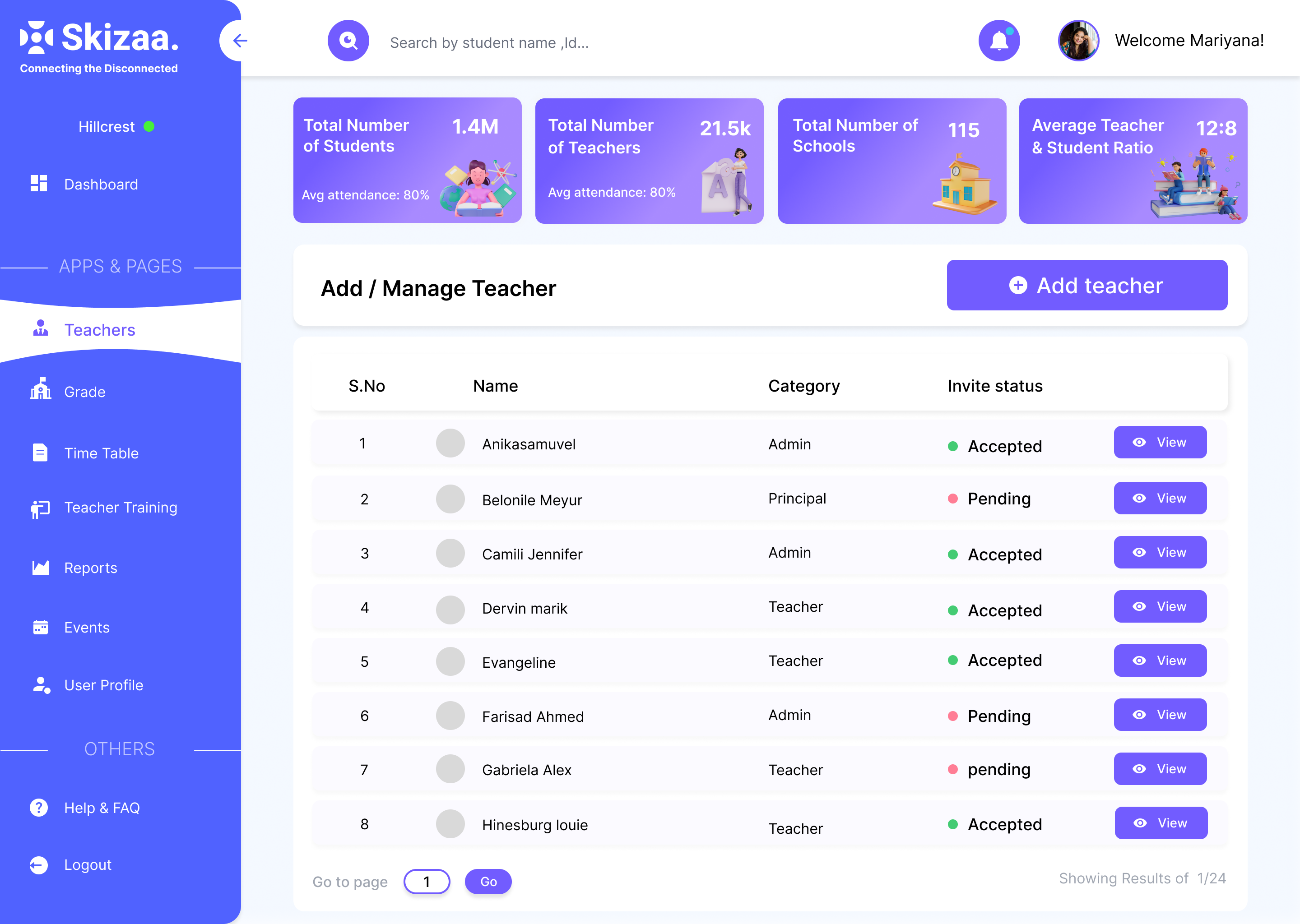
Before — fragmented, cluttered, hard to navigate
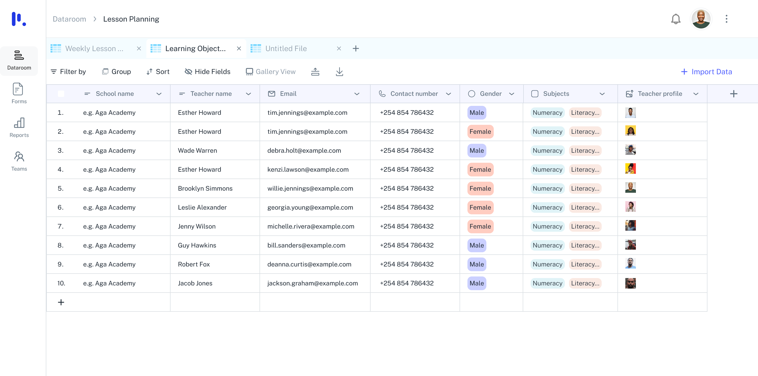
After — clean, collaborative, AI-powered
One of the biggest gaps in the original design was that collaboration felt like an admin task — buried in settings, requiring multiple steps. I redesigned it to feel like a natural part of working with data.
Invite teammates in a few clicks — from directly within the table view, not in a settings panel
Assign roles — Editor, Creator, or Reader — with clear permissions at a glance
Leave or remove users — team management is streamlined and obvious, not buried
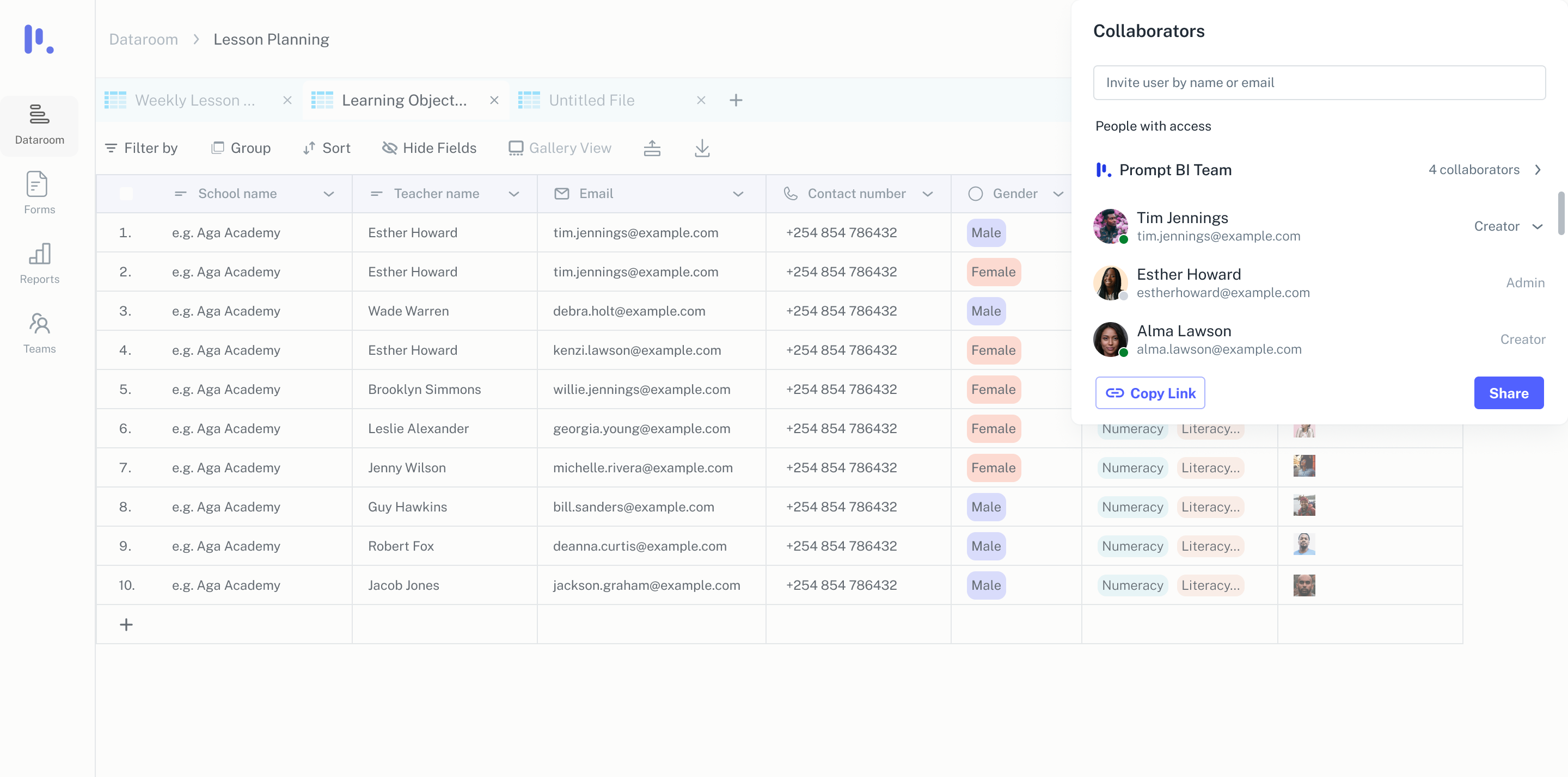
Invite, assign, manage — all within the workspace
Once a table is set up, users can ask questions directly through the AI assistant — generating summaries, charts, or written insights without any manual setup. These insights can be copied, shared, or saved directly to the dashboard for later use.
Key Design Decision
The AI assistant is surfaced contextually — it appears when a table is active, not as a separate tool to navigate to. This reduces the mental overhead of "switching to AI mode." The data and the insights live in the same space.
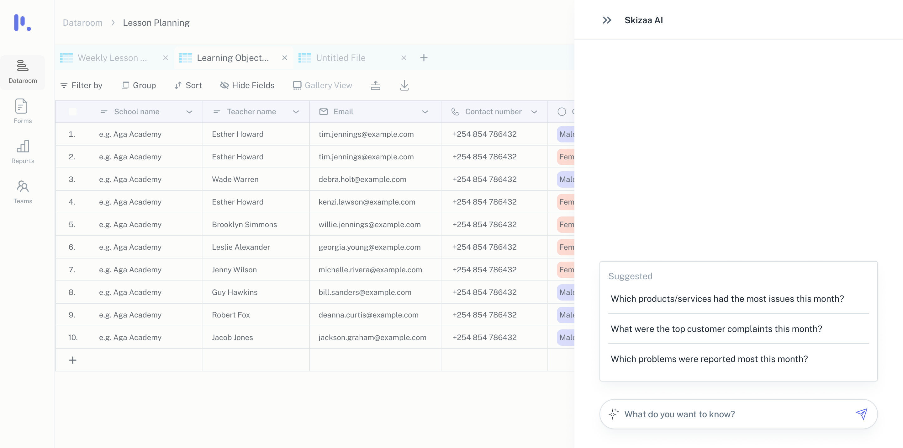
AI insights surface in context — no mode switching required
The redesign reduced friction at every interaction — from opening a cell to add a note, to downloading a cleaned version of a dataset. Support for multiple file types means users can move fluidly between collecting, structuring, analysing, and exporting.
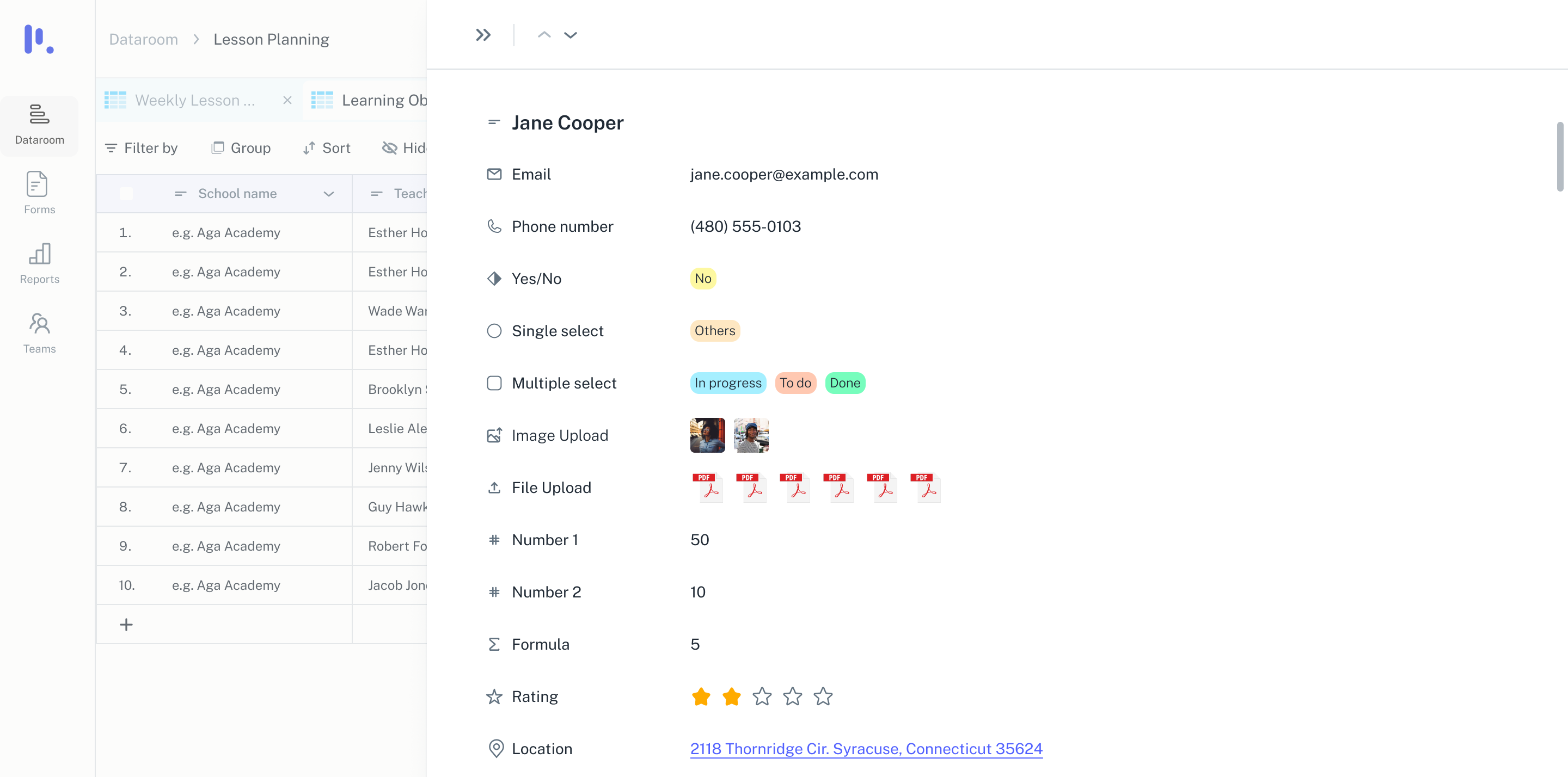
Every interaction feels intentional — from cell notes to file exports
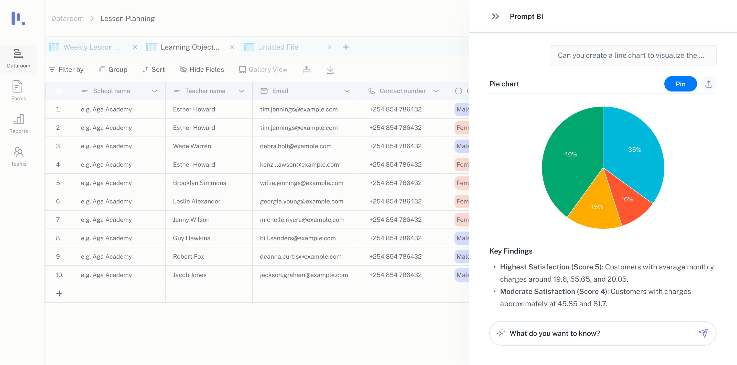
The full Dataroom — organised, collaborative, AI-powered
Dataroom isn't just a desktop tool — it powers real-time workflows across platforms. One of its key extensions is a mobile app used by teachers to manage attendance, schedules, and student data on the go. The data teachers capture on mobile syncs instantly to Dataroom, where teams can analyse, collaborate, and act on it.
Designed for one-handed, quick interactions — used in short bursts between classes, not at a desk
Reduced steps in high-frequency tasks — attendance from class list to submitted in a few taps
Real-time sync with Dataroom — teachers mark attendance on mobile, data surfaces instantly for analysis
Key Design Decision — Default to present
The attendance screen defaults to "all present" — teachers tap only to mark absent. In a class of 30, most students are present most of the time. Designing for the majority case made the common workflow faster without making exceptions harder. One decision, meaningful reduction in daily friction.
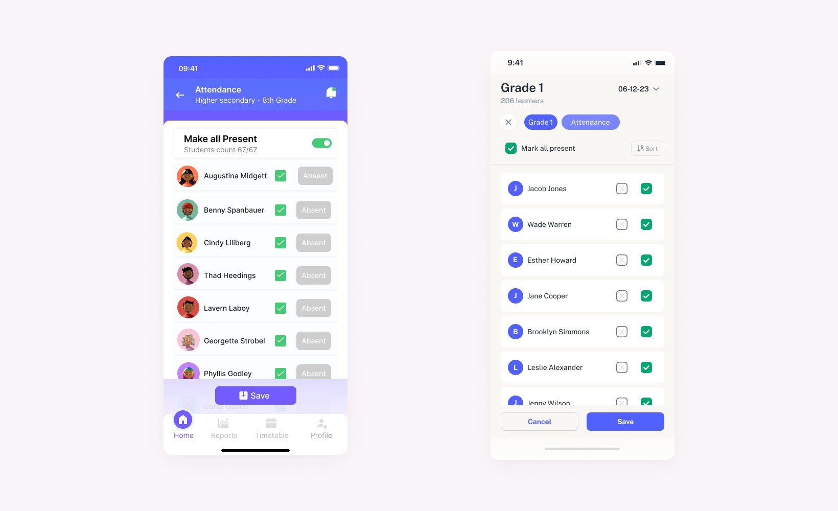
Attendance — default to present, tap to mark absent. From class list to submitted in a few taps.
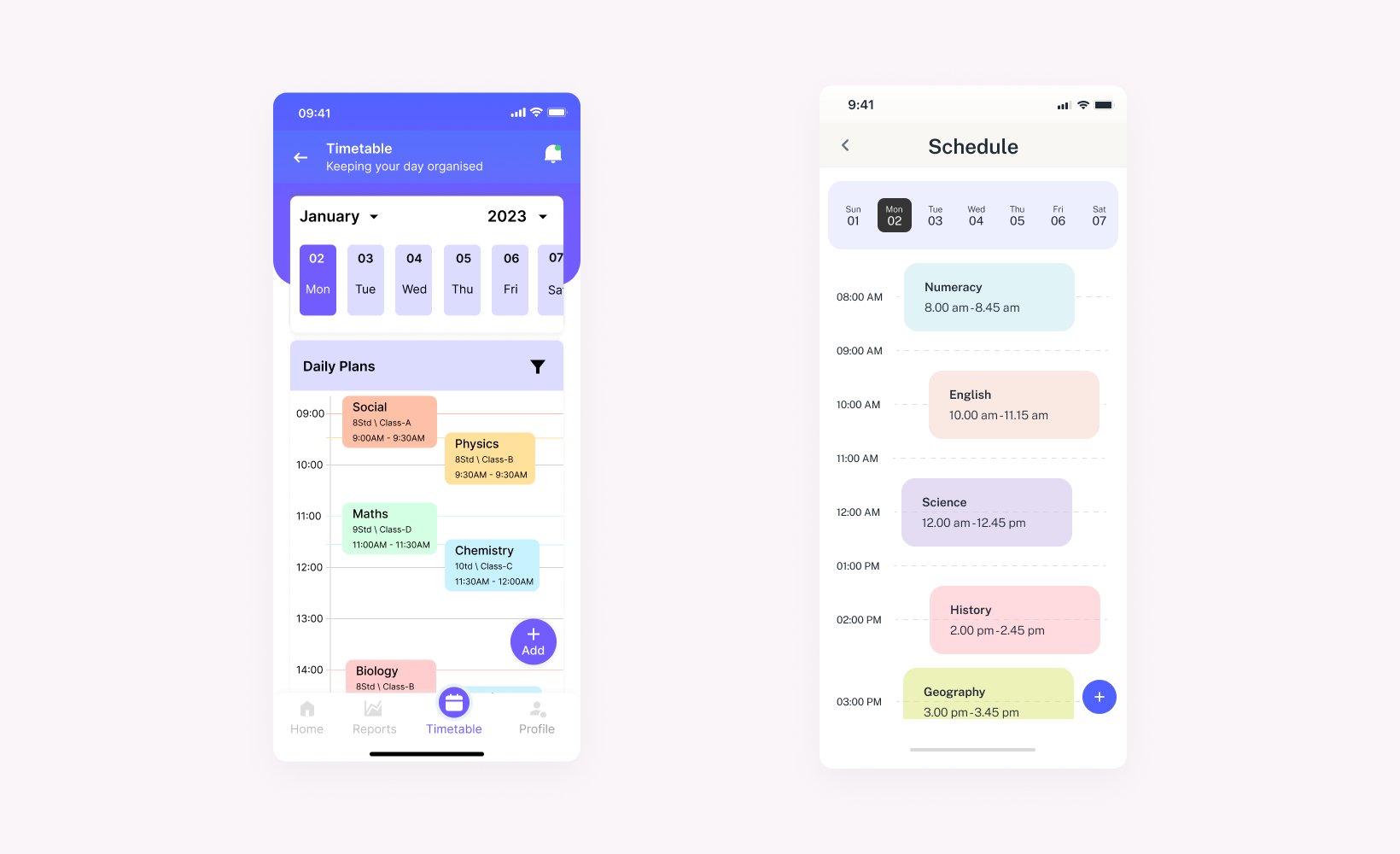
Schedule
Analytics
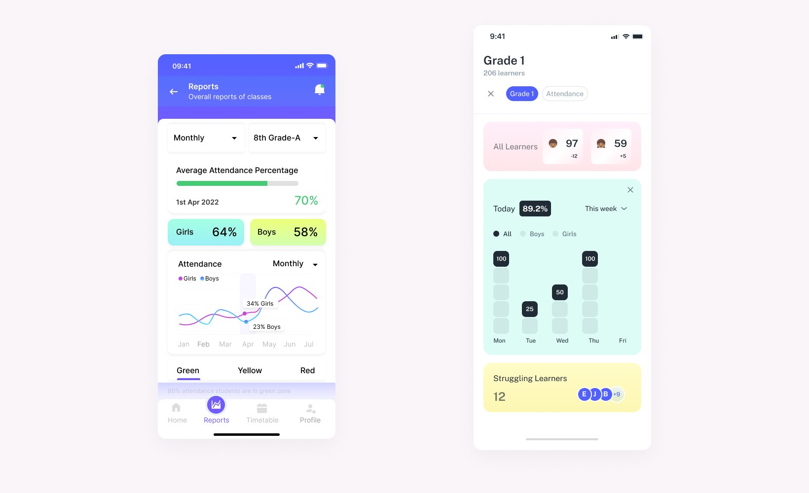
Weekly schedule and student analytics — surfaced where teachers need them, readable in 30 seconds.
The core insight from this project: collaboration and AI features don't fail because they're hard to build — they fail because they're hard to find. Redesigning the information architecture so these features appeared where users already were, rather than in separate panels, was the most impactful change.
The mobile extension reinforced a system-level lesson: the value of Dataroom isn't just in what it shows on desktop — it's in what it enables across the full workflow. Teachers generating data on mobile, teams acting on it in Dataroom. That loop is the product.