Product Design · B2B SaaS · Restaurant Operations
Restaurant staff shouldn't have to think about the POS. They should think about the guest. Here's how I designed a system that disappears during service.
Rebuilt
Inherited an existing POS and rebuilt the operational core — from a single dense form to a five-module system
5
Interconnected modules — each decision in one module had downstream consequences in others
2
Completely different restaurant types served by one system — without either experience being compromised
Live in production — onboarded restaurants are running on it daily, across both table-service and counter-service formats.
A POS used by people with their hands full. Staff carrying plates, shouting across a noisy kitchen, managing impatient guests. Five seconds of friction per order compounds across a full dinner service — wrong tickets, missed payments, staff calling corrections verbally because they don't trust the screen.
The harder constraint: Pikky had to work for two fundamentally different restaurant types — a fine-dining floor managing 20+ tables and a QSR counter running customers in fast sequence. One interface trying to serve both would fail both. I joined as the sole designer, responsible for all five modules from day one: Live Orders, KOT, Menu & Inventory, Settings, and Transactions.
Three principles I kept returning to
Act without thinking → actions obvious before decision is needed
Glance, don't read → status readable in under 1 second
No surprises → output visible before you commit
Before any UI, I mapped the full system logic — every order state, every role, every permission boundary, and what happens when things go wrong.
Mapped full system logic — states, roles, permissions, failure modes
FOH staff — speed, zero cognitive load. Action obvious before decision.
Kitchen staff — glanceable, distance-readable. Status in half a second.
Owners — control, predictability. Output visible before commit.
None of the five modules are independent — every decision cascades across the system:
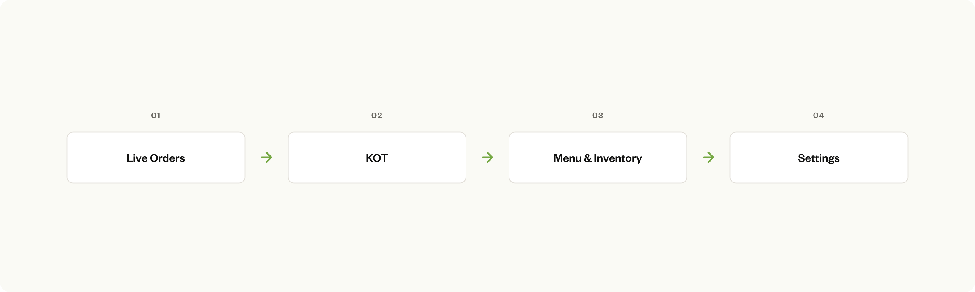
The four areas of the Pikky POS I designed
System dependencies
The early product showed two problems clearly: the menu screen was a recipe database that buried operational details inside dense forms; the orders screen mixed bill requests and active orders with no hierarchy. Both tried to do too much at once. The fix was simple — one screen, one job.
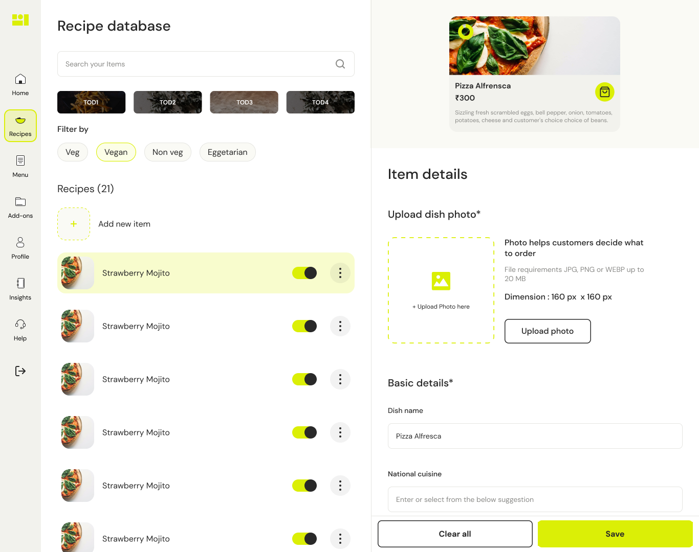
Early menu screen — recipe-style form before the Dishes / Ingredients split
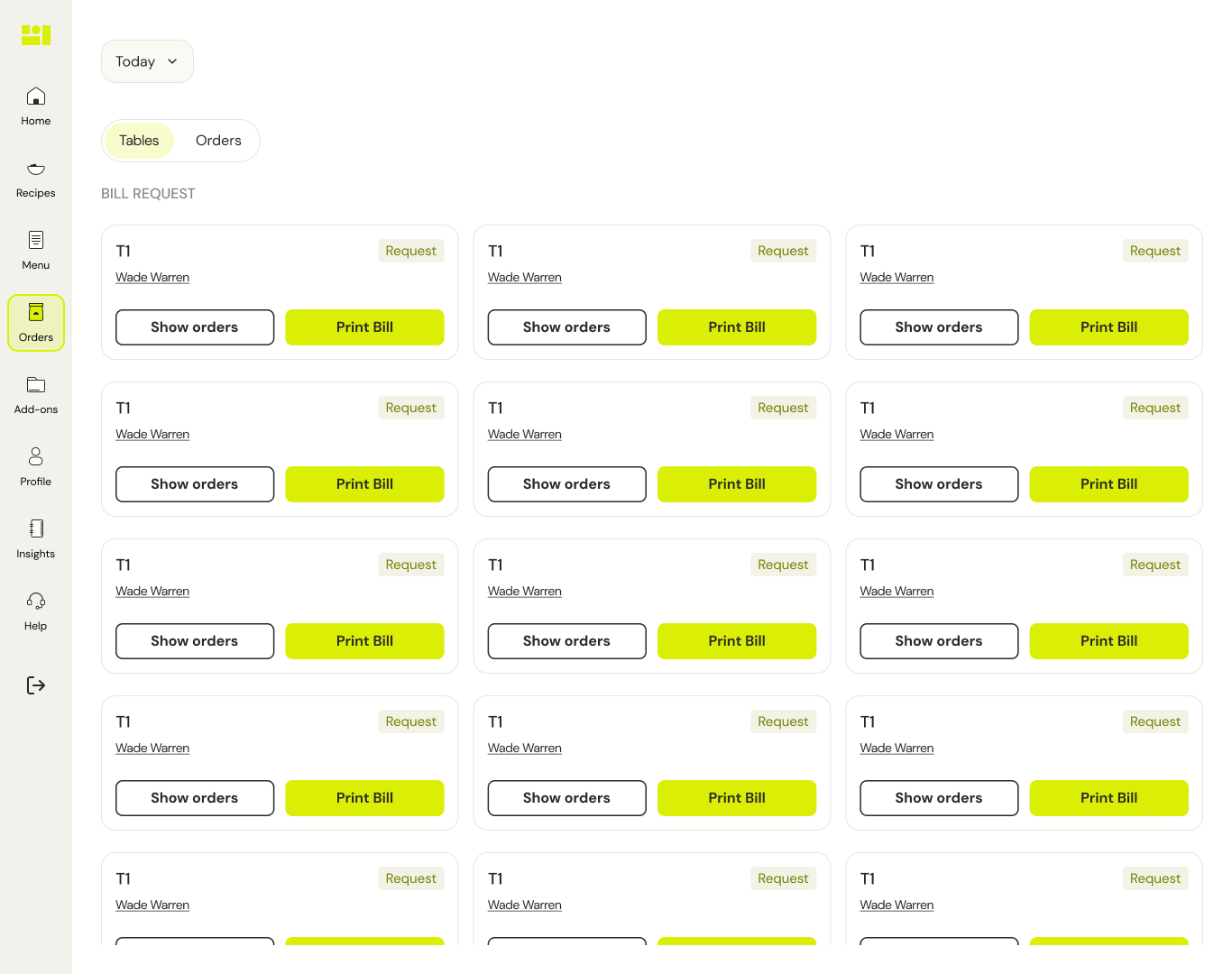
Early orders — bill requests and active orders mixed before the counter / table split
Fine dining and QSR aren't variations of the same workflow — they're different mental models. A mode toggle would just export that decision to the staff. The solution: the restaurant selects their type at onboarding. The POS adapts permanently — no toggle, no irrelevant UI, same system underneath.
Why onboarding-driven, not a toggle
A toggle means staff make a decision before they can work. An admin setting means the wrong view is one accidental change away. Locking it at onboarding means the interface is never wrong for the context.
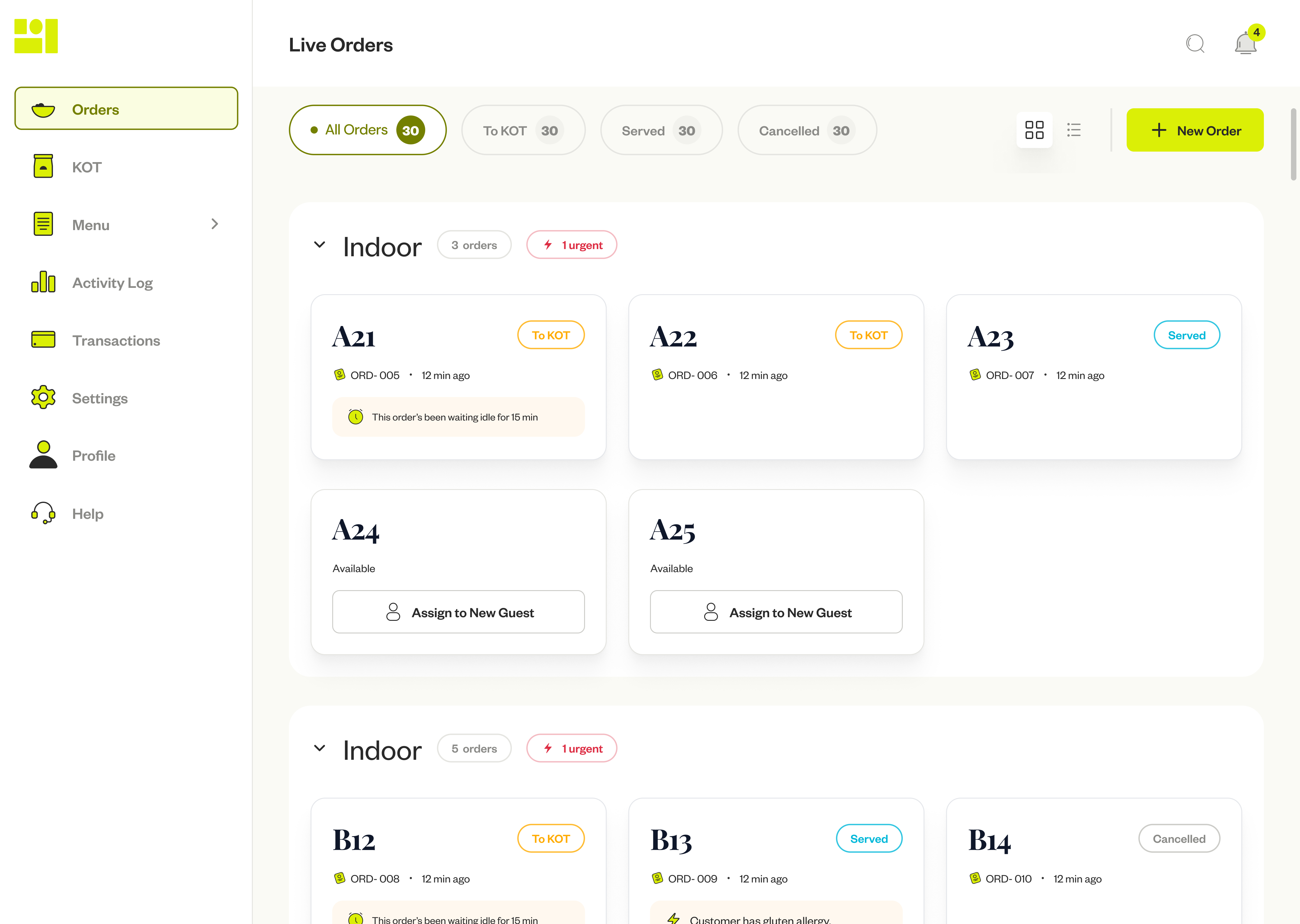
Table view — full floor at a glance, table state visible before you tap
Payment-first. Customer orders, pays immediately, waits. KOT fires the moment payment confirms. No floor plan, no "served" step — just a sequential queue.
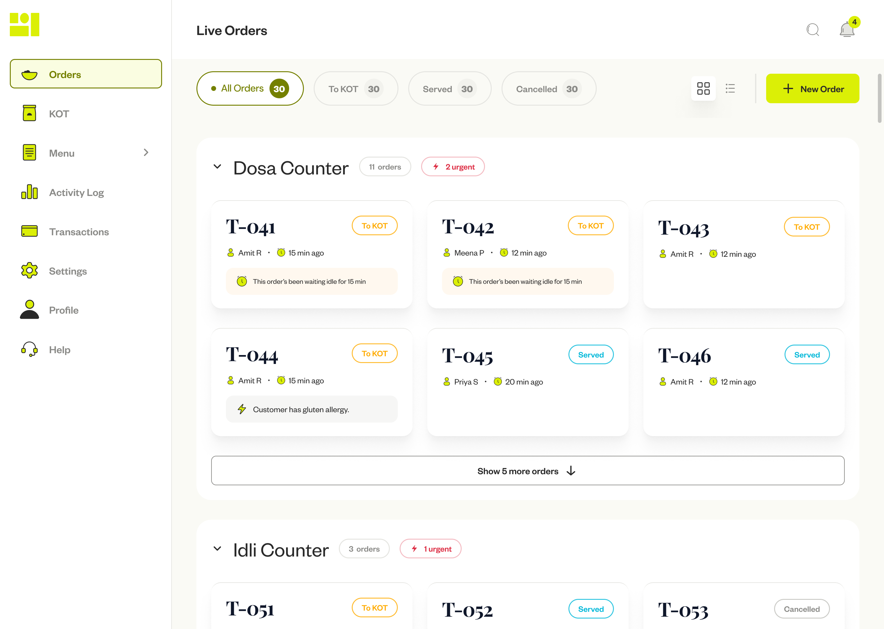
Counter view — sequential, payment-first
App orders skip the manual creation step entirely — no staff involved until the kitchen sees it. The order appears already paid, and the KOT fires without anyone touching the POS.
Edit lock — tied to kitchen state, not payment state
Staff can edit an order only while kitchen status is "New." Once the kitchen marks "Preparing," the order locks. The damage isn't a modified order — it's food prep already underway when a modification arrives. Locking at the right moment prevents the real failure, not just the theoretical one.
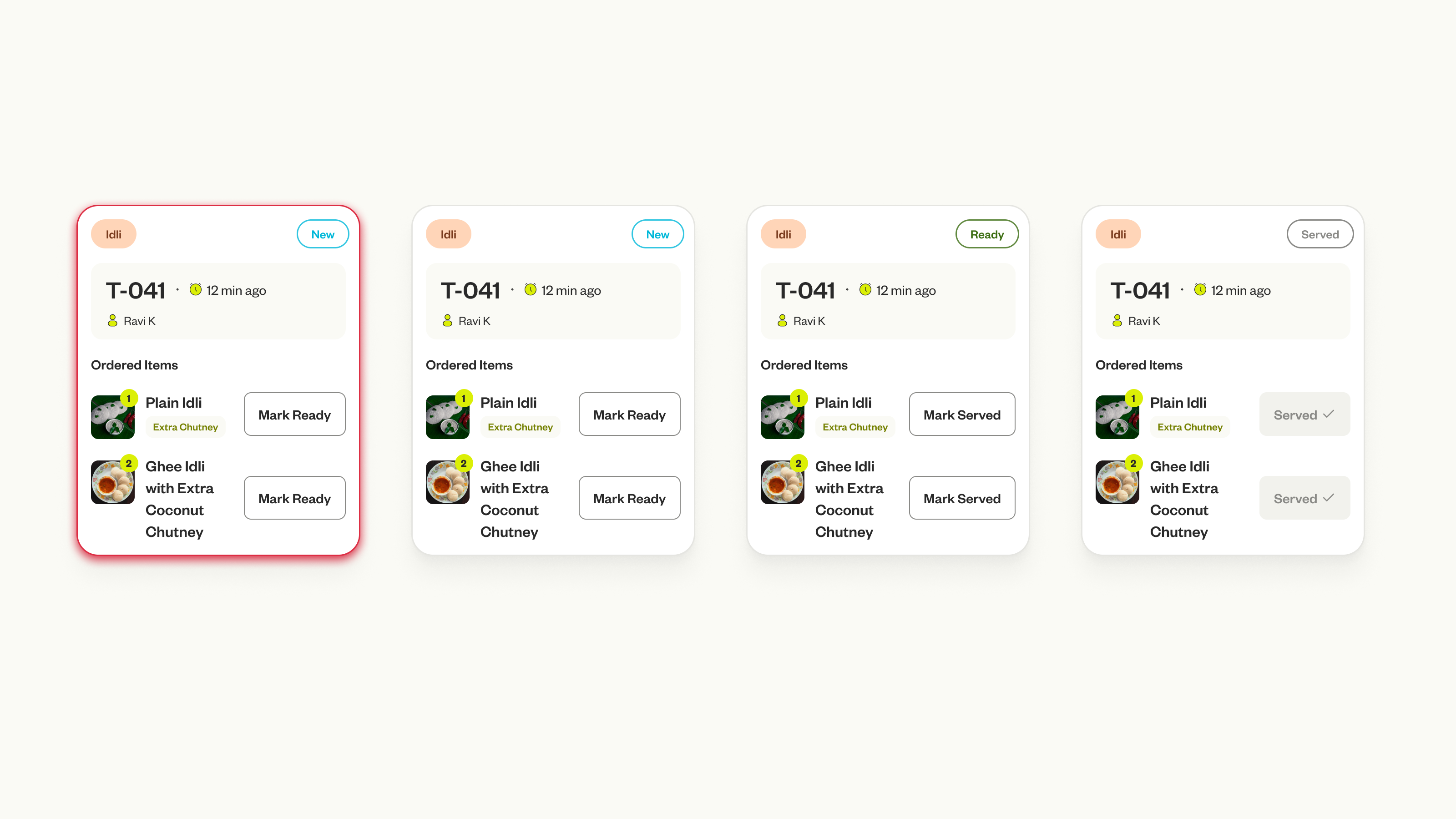
Order state progression — consistent across both modes
Real POS usage is messier than the happy path. Three I explicitly designed for: Partial completion — a card enters "Partially Ready" state (a muted badge, visually distinct) so FOH knows not to call it yet. Cancellation after KOT fires — surfaces as a struck-through item with a "Cancelled" label on the KOT display, not a silent deletion. Additions mid-service — generates an addendum KOT labelled "Addition to T-041," so the kitchen sees only what's new.
The first version failed during service. Not visually — it looked fine. It failed because it assumed an order completes as a single unit.
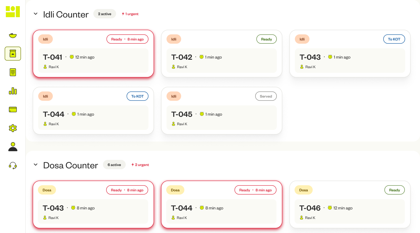
A South Indian counter order — idli, dosa, sambar — doesn't complete together. Idli is done in 3 minutes, dosa in 6. With one card-level CTA, the kitchen either blocked the whole order waiting for the last item, or marked it ready prematurely. Neither was acceptable. The issue wasn't the button — it was the assumption.
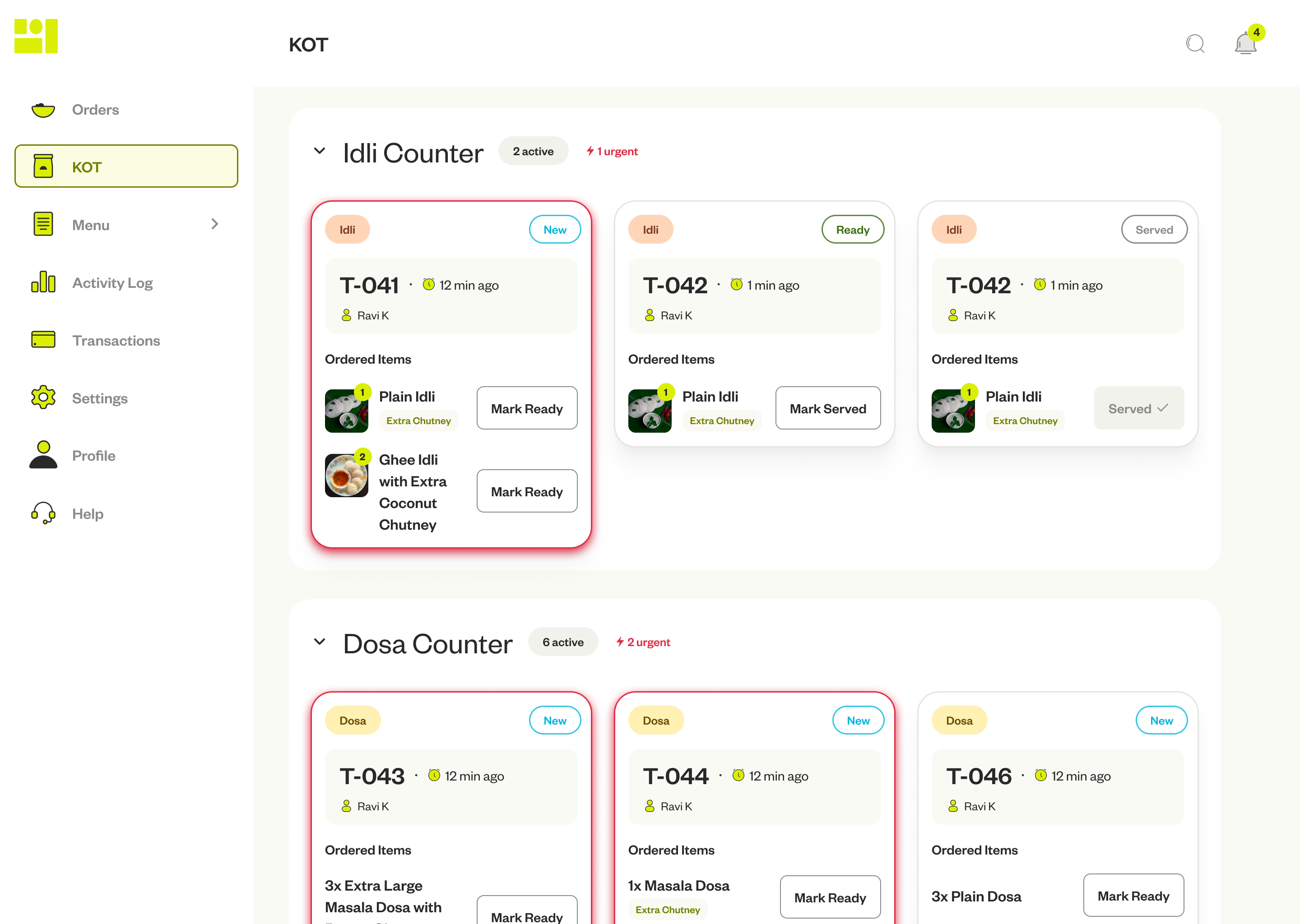
KOT — large tokens, colour-coded urgency, counter-filter tabs per station
What changed and why it was the right tradeoff
Each item gets its own CTA. Kitchen staff mark dishes ready as they finish — the card aggregates item states and promotes itself when all items resolve. Item states → order state, never the reverse.
The density tradeoff: more CTAs means more UI on screen. Handled by collapsing completed items to a quiet confirmation chip — the interaction surface shrinks as work completes. A 4-item card doesn't stay a 4-button grid for long.
Why buttons, not gestures: kitchen staff wear gloves, hands are wet, arm's length from the screen. Large labelled tap targets, generously spaced, each anchored visually to its item row. Error prevention first; recovery second (the action is reversible — a wrong tap costs one undo, not a dialog on every correct tap).
Before → After
Before: "Is table 4 ready?" "Almost, waiting on the dosa." Verbal sync, constantly.
After: The system is the source of truth. FOH checks the screen. The loop disappears because the interface answers it.
Two layers — Dishes and Ingredients — both live operational tools. Stock checkable mid-service, dish availability toggled the moment something sells out.
Dishes: list for fast scanning, grid for visual overview. Price, type, and stock visible without opening anything. The Add Dish form is intentionally comprehensive — restaurant menus are complex, and hiding that complexity just makes it harder to configure correctly. Section grouping and progressive disclosure keep it manageable.
Ingredients: stock as a visual bar — green, orange, red. Every ingredient links to the dishes that use it. Mark tomatoes low, see exactly which dishes are at risk. Before service, not during it.
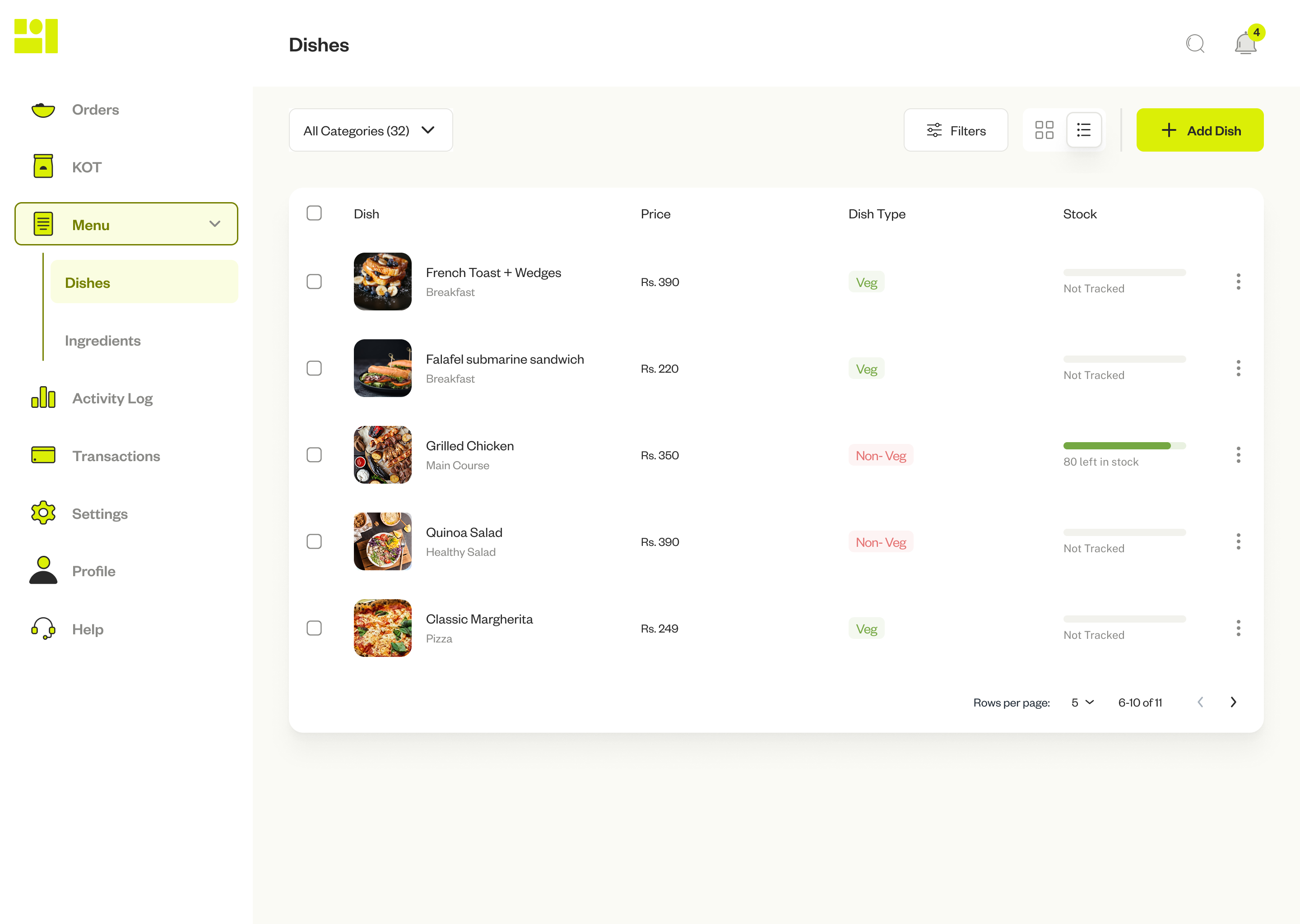
Dishes — filterable by category, type, stock status
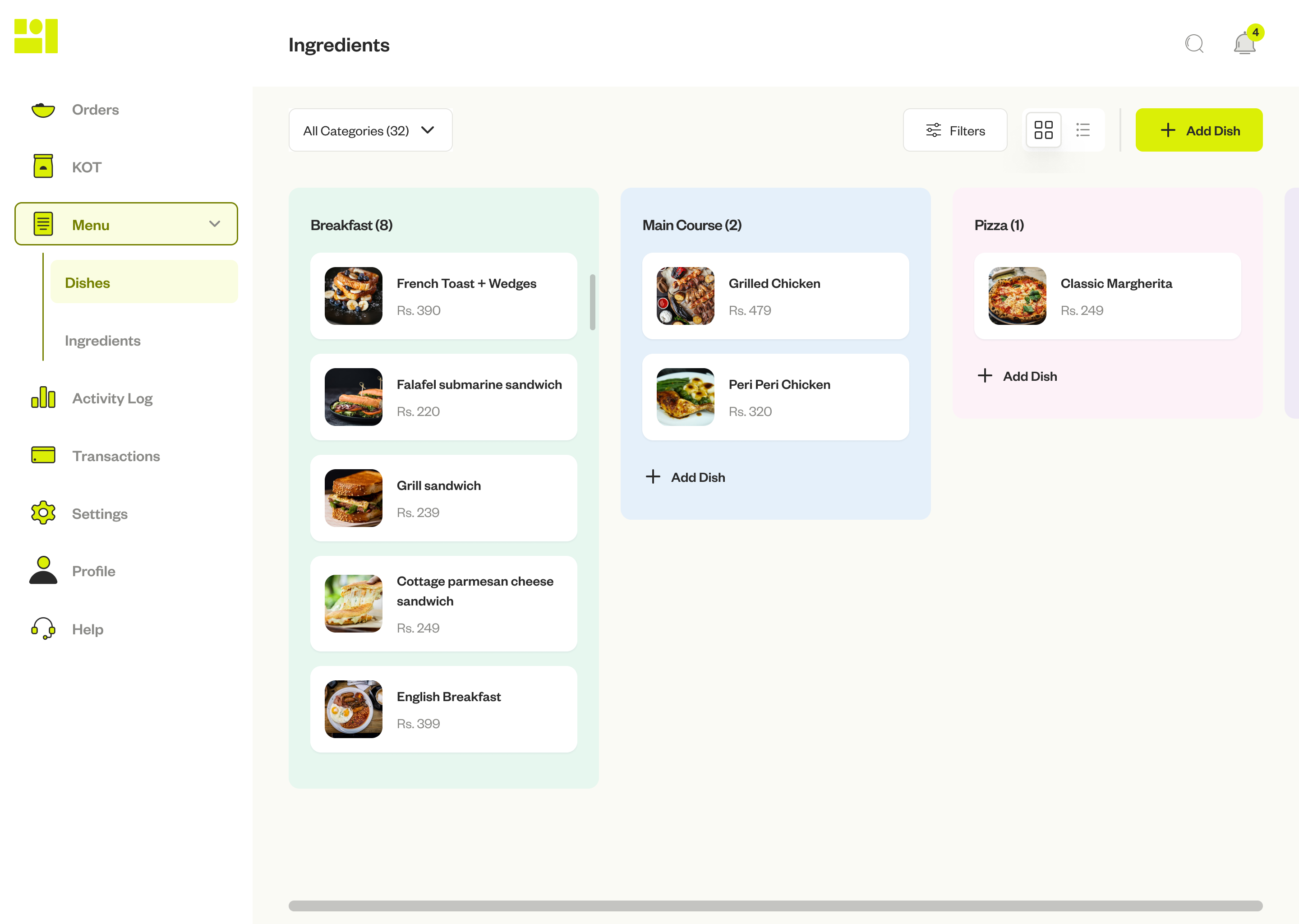
Grid view — category-grouped, visual overview
Add Dish depth
The Add Dish form is intentionally comprehensive. Restaurant menus aren't simple — a single dish can have size variants, sauce customisations, allergen flags, and different pricing tiers. Designing a form that handles all of this without feeling overwhelming required careful section grouping, progressive disclosure, and inline defaults. Every field has a reason to exist.
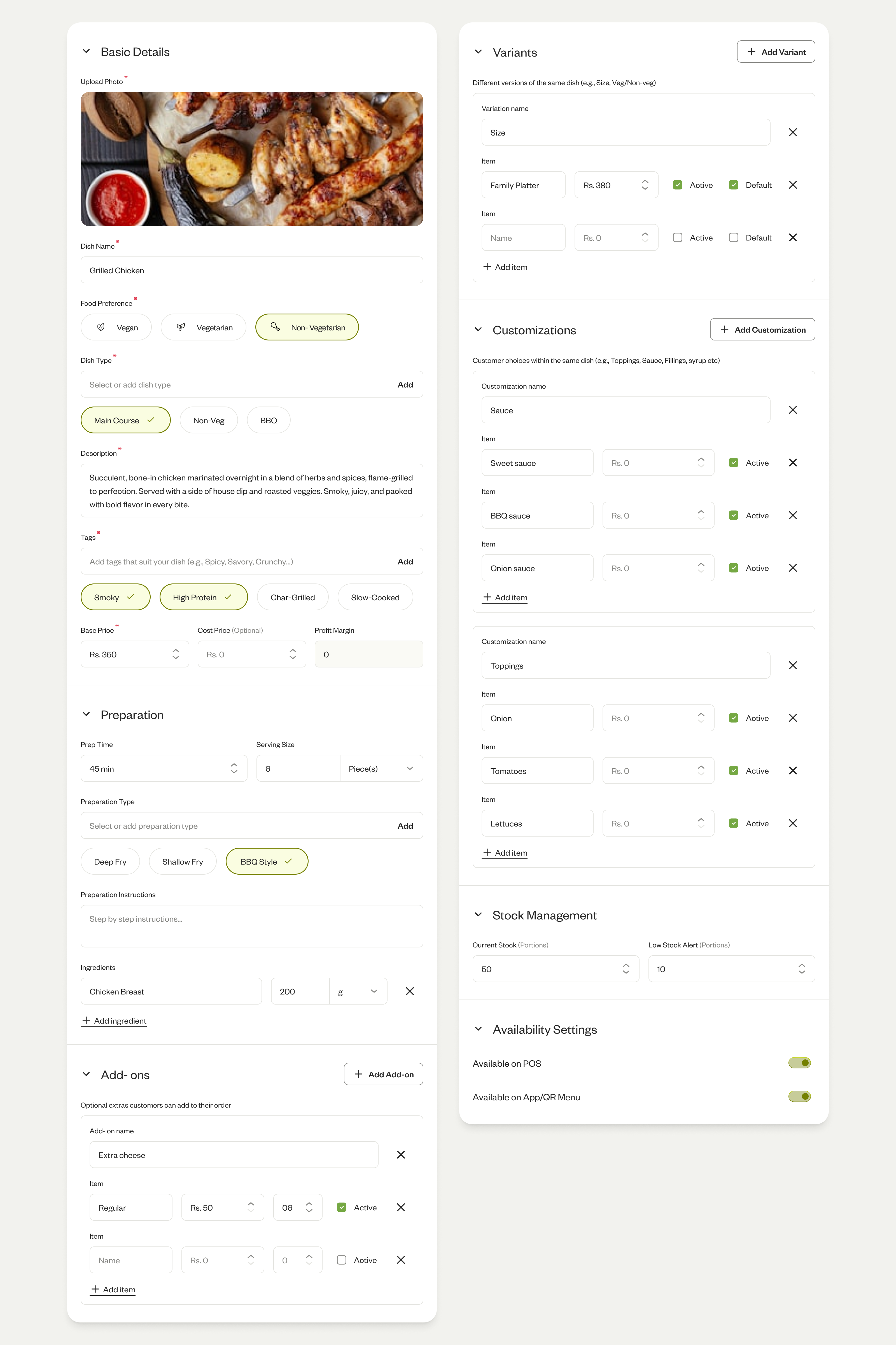
Add Dish — comprehensive but structured
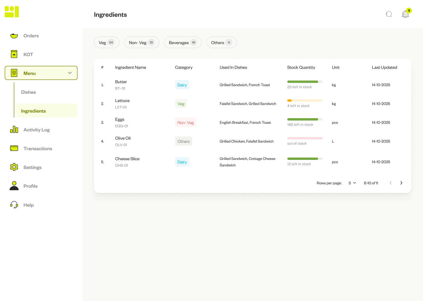
Ingredients — stock at a glance, affected dishes surfaced inline
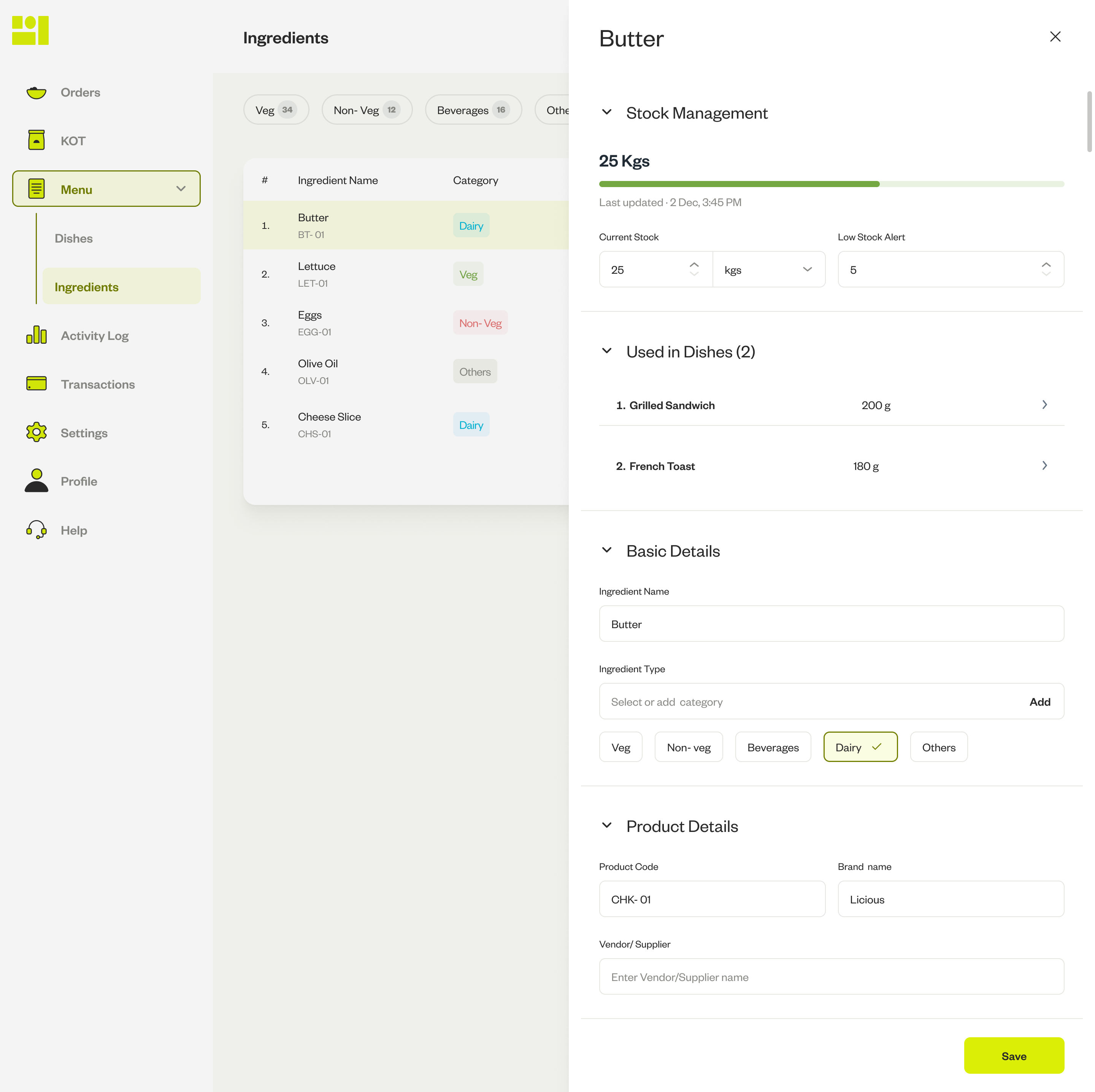
Ingredient detail — stock, dishes, and supplier info in one panel
Five areas: Business Info, Team, Payments, Taxes & Charges, Printers & Formats. One pattern across all of them: owners using the early product would make a change, then print a test bill to verify it. Every setting required external confirmation. The fix — live preview before save, everywhere.
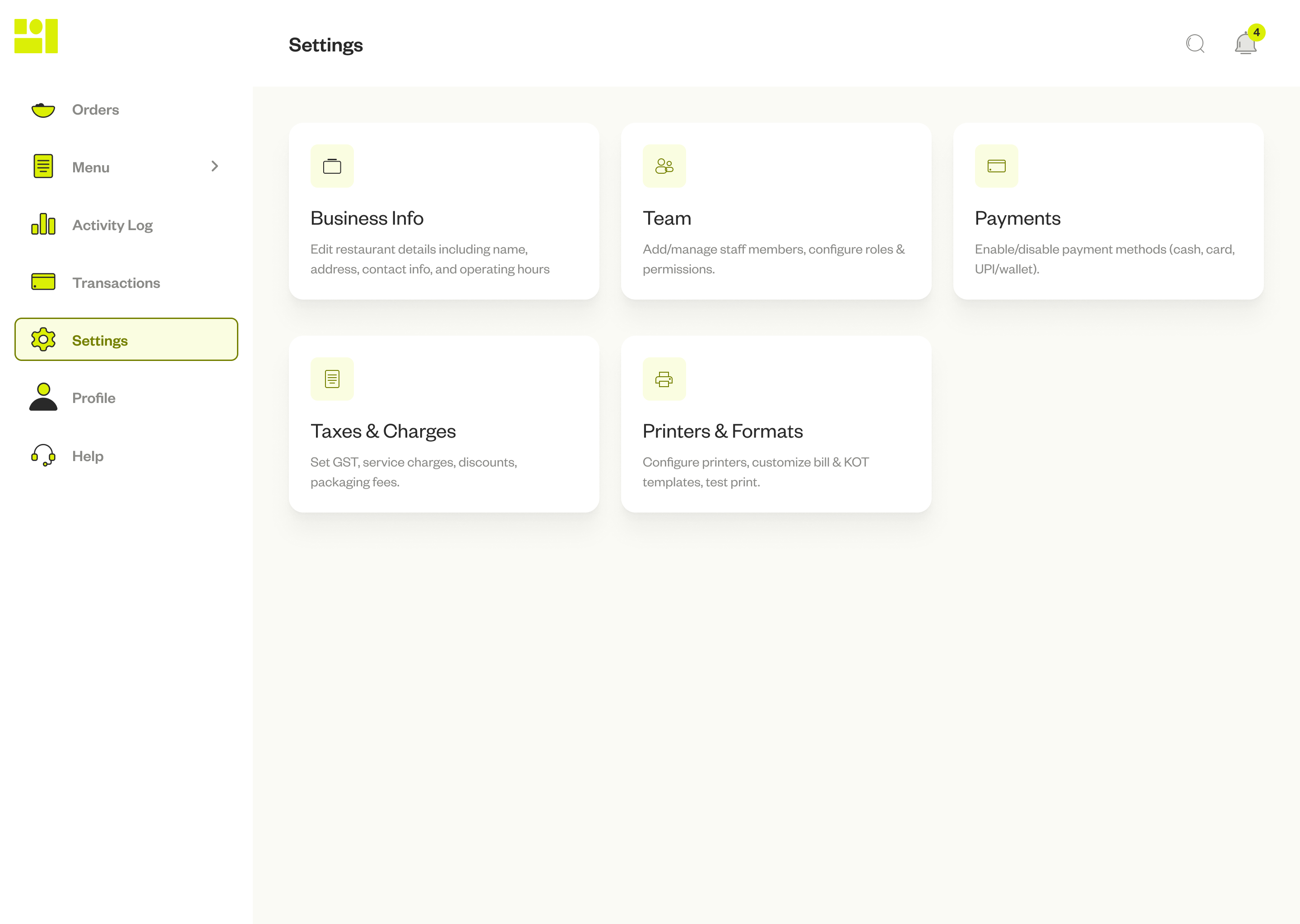
Settings — five clear areas, each with a specific job
Taxes & Charges is where the stakes are highest. GST inclusive vs. exclusive, packaging fees, round-off — each toggle affects the bill in non-obvious ways. The preview on the right updates as each setting changes. Owners see the exact bill before committing. Printers auto-detect on the local network; layouts are fully customisable with a one-tap test print.
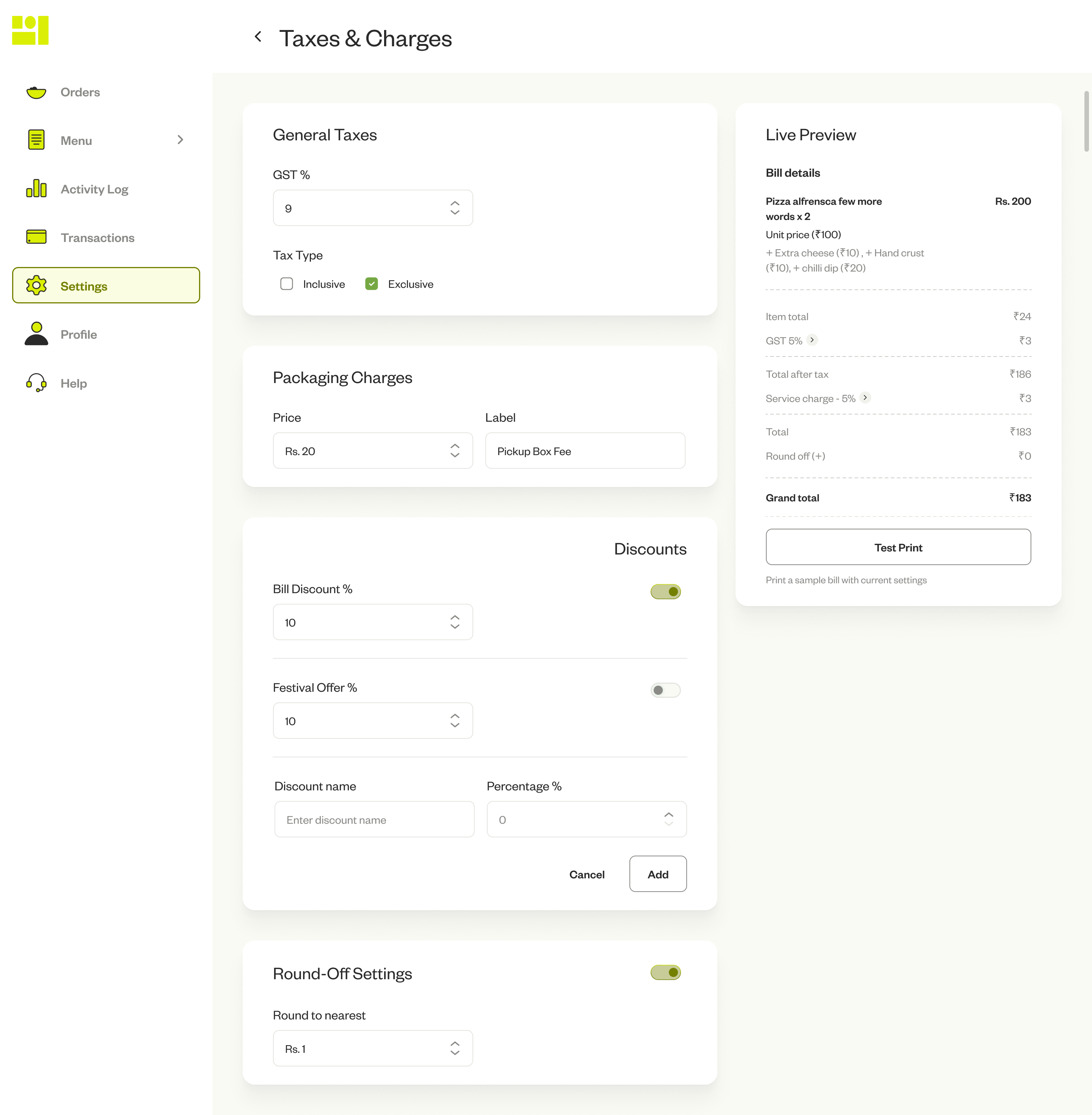
Taxes & Charges — live bill preview updates with every toggle
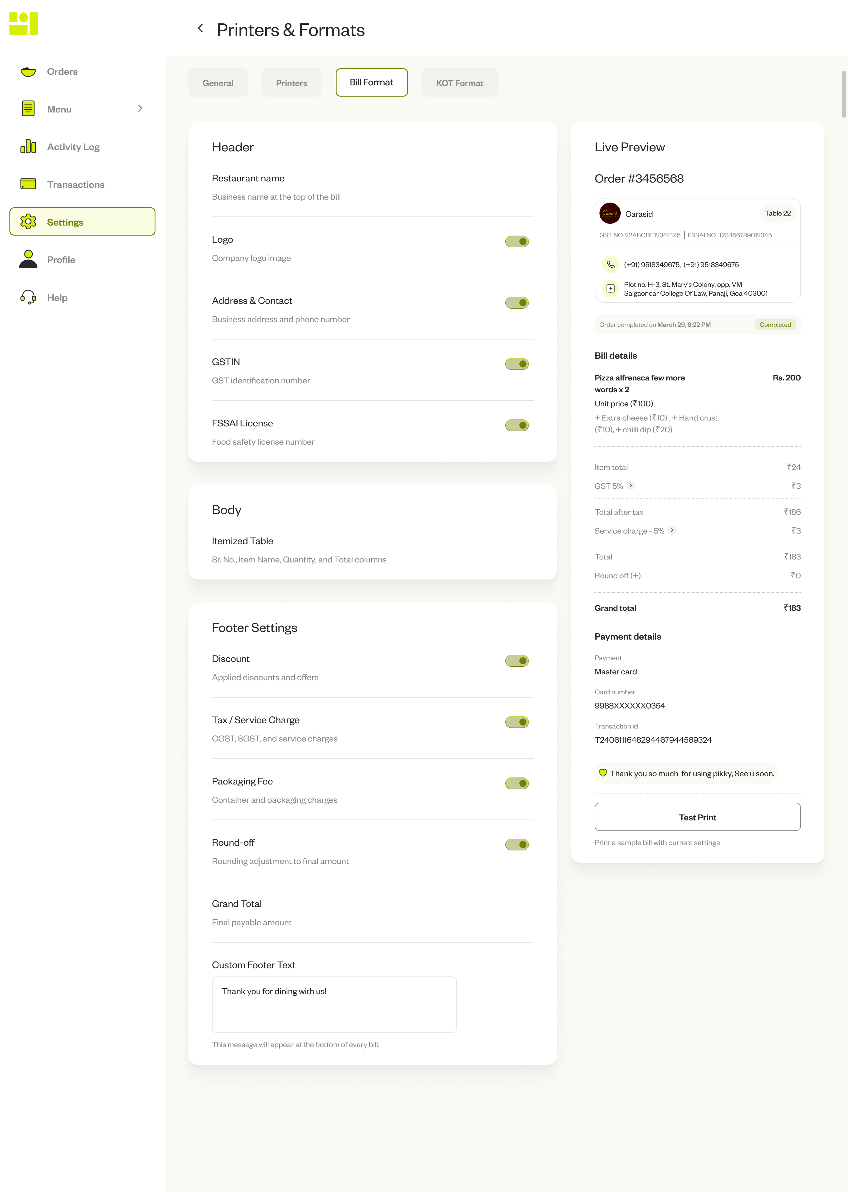
Bill format — customise with live preview at every step
Owned by the owner, not the staff. List view shows status and payment method at a glance; clicking opens a full slide-in panel with the itemised bill, discount breakdown, and GST split. Every transaction downloadable. End-of-day reconciliation in minutes, not an investigation.
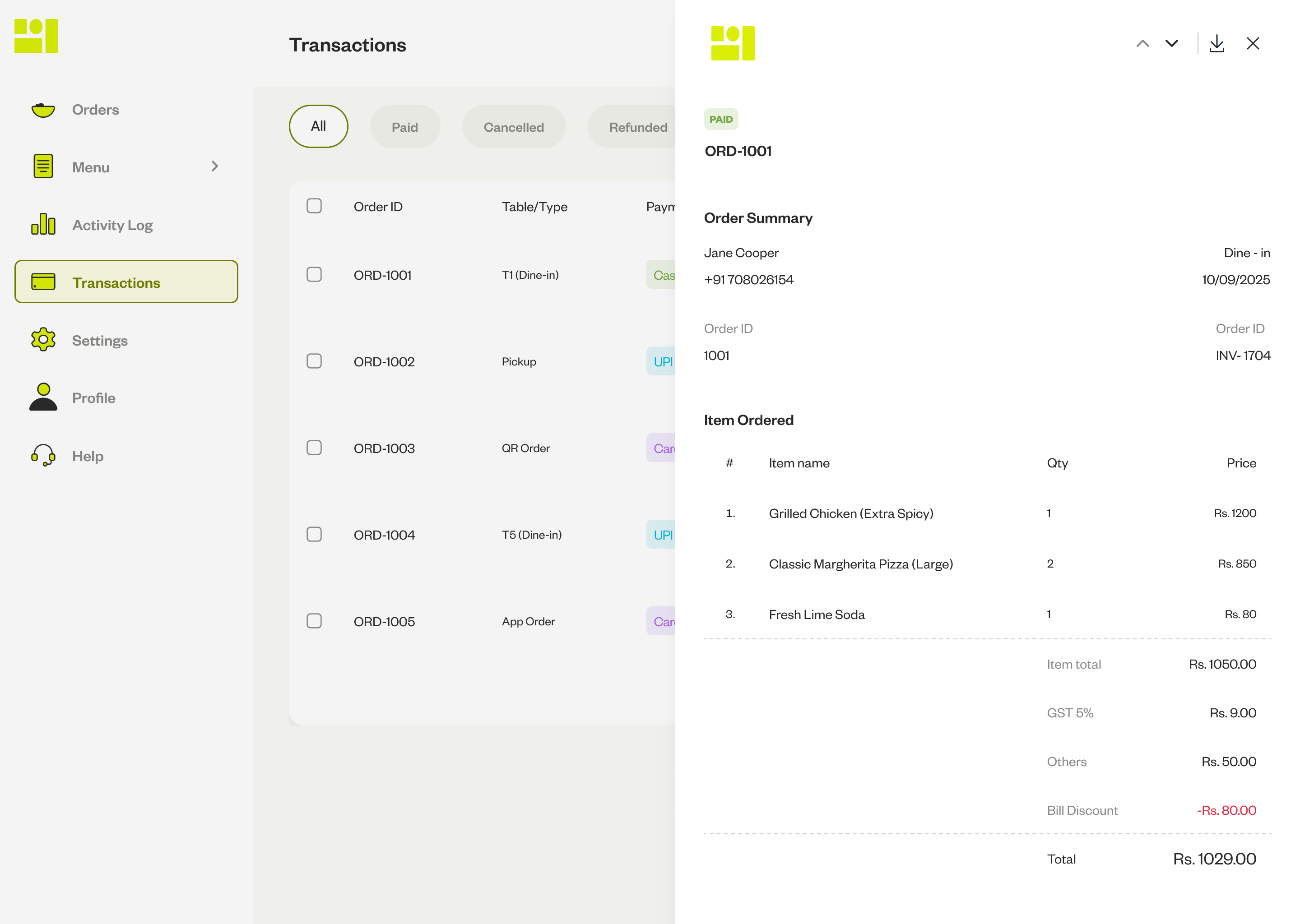
Transactions — filterable list, full detail on click
The hardest part wasn't any individual screen — it was holding the full system simultaneously. Every module has downstream consequences in others. The live preview pattern came from watching owners print test bills after every settings change — they didn't trust the screen to show them what would happen. Bringing the output inside the interface removed that anxiety. That principle applies everywhere a decision has a downstream effect.
What I'd change: I'd prototype the KOT interaction with kitchen staff before finalising the state model. The signal was there early — dishes clearly had different prep times in the flow map. I noted it and moved on, assuming the kitchen would adapt. They didn't adapt; they went verbal, and the POS became a partial tool. A 30-minute session watching how staff actually mark tickets would have caught the atomic-completion assumption before it shipped.
What's still unresolved: the Activity Dashboard. The data exists in Transactions. The design problem is making it answer questions owners actually ask at end of night — not just visualise numbers they don't know how to act on.