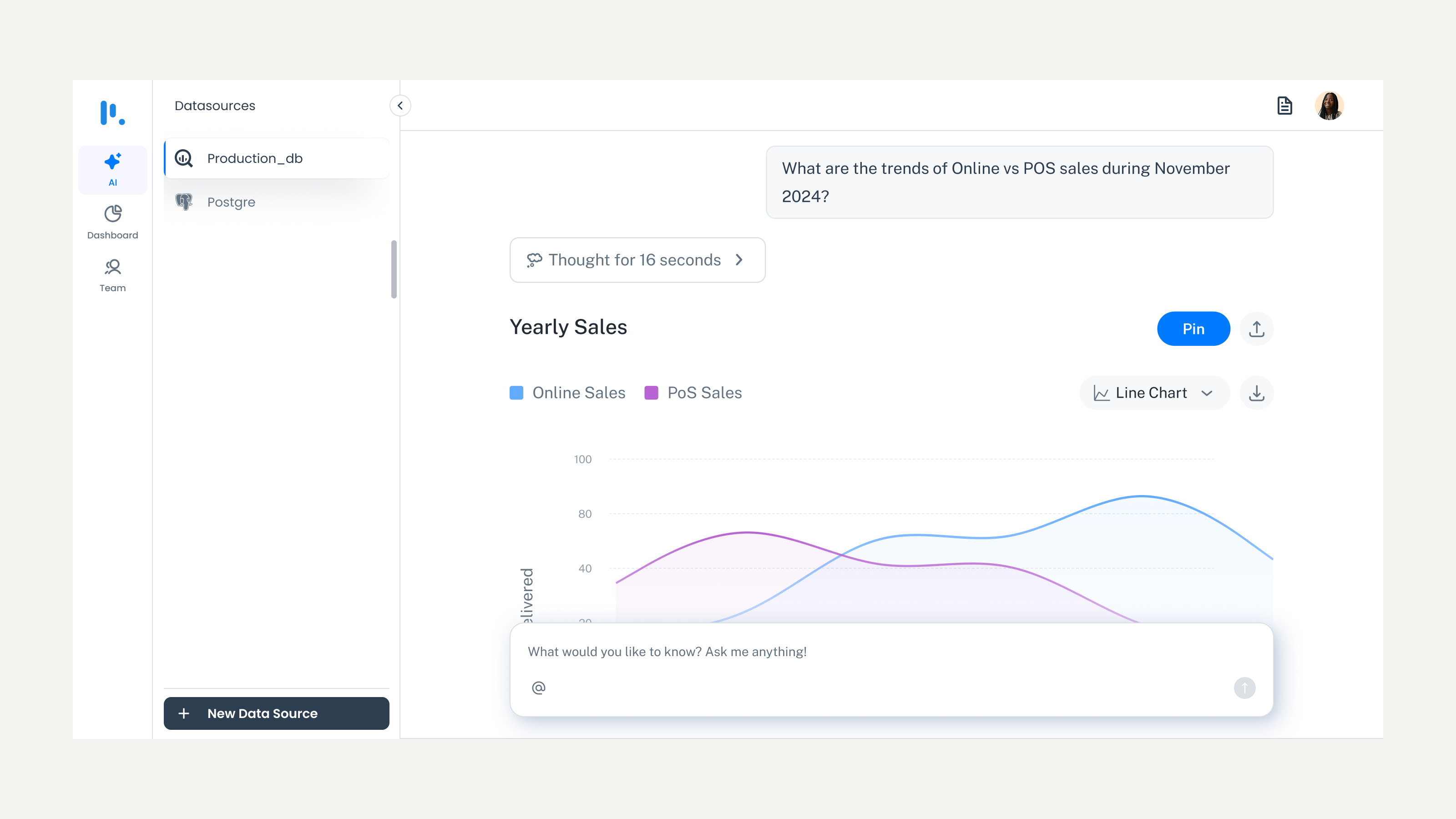
Product Design · AI Product · Data Visualisation
From raw data to shareable insights, without needing a data analyst. A two-part system: an AI query interface and a live analytics dashboard.
0
Technical setup required
Plain
Language queries — no SQL needed
Live
Dashboard with auto-updating visuals
Non-technical users were locked out of their own data. Getting answers required a data analyst, writing SQL queries, or waiting for someone else to build a report. And even when insights were produced, they lived in spreadsheets — impossible to track, share, or act on over time.
The challenge: design a system that handles file uploads, enterprise database connections, natural language queries, and interactive dashboards — but stays simple when a non-technical user needs an answer fast.
The experience starts with connecting your data. Simple as that. Once a file is added or a database is connected, Prompt BI immediately gets to work — no manual configuration needed.
Auto-generates an editable overview — the moment data is connected, users see a summary of what they're working with
Flags missing values and data issues — before the user even asks a question
Detects table relationships — automatically, so users don't have to think about joins
Previews data with column names, types, and sample rows — no guesswork, no technical setup
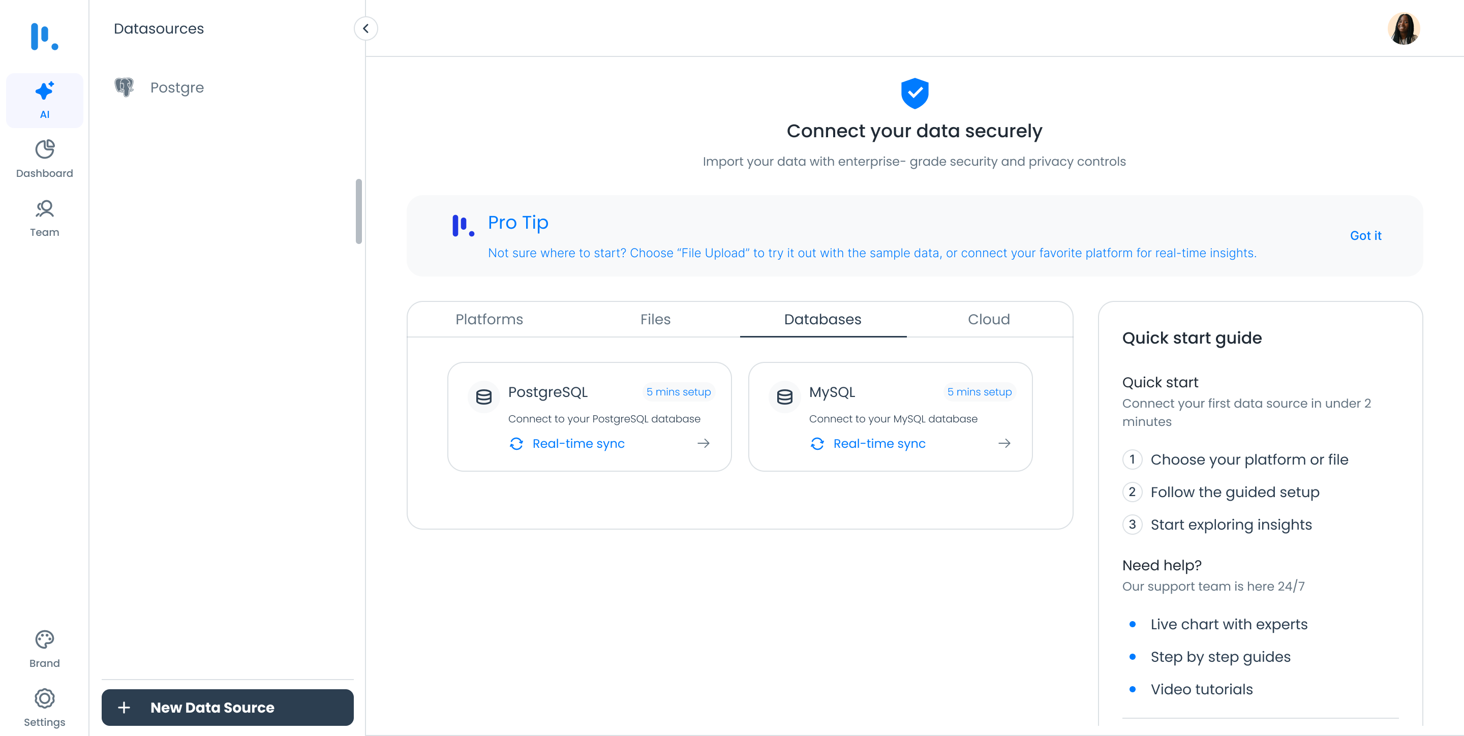
Connect your data — Prompt BI takes it from there
After setup, users ask questions about their data in plain language. They can mention table names for context or use smart suggestions. It's not just about data analysis — it's about having a conversation with your numbers.
Key Design Decision
Smart suggestions surface automatically as users type — reducing the intimidation of an empty query field. For users who don't know what to ask, we show them what's possible. The entry point is curiosity, not expertise.
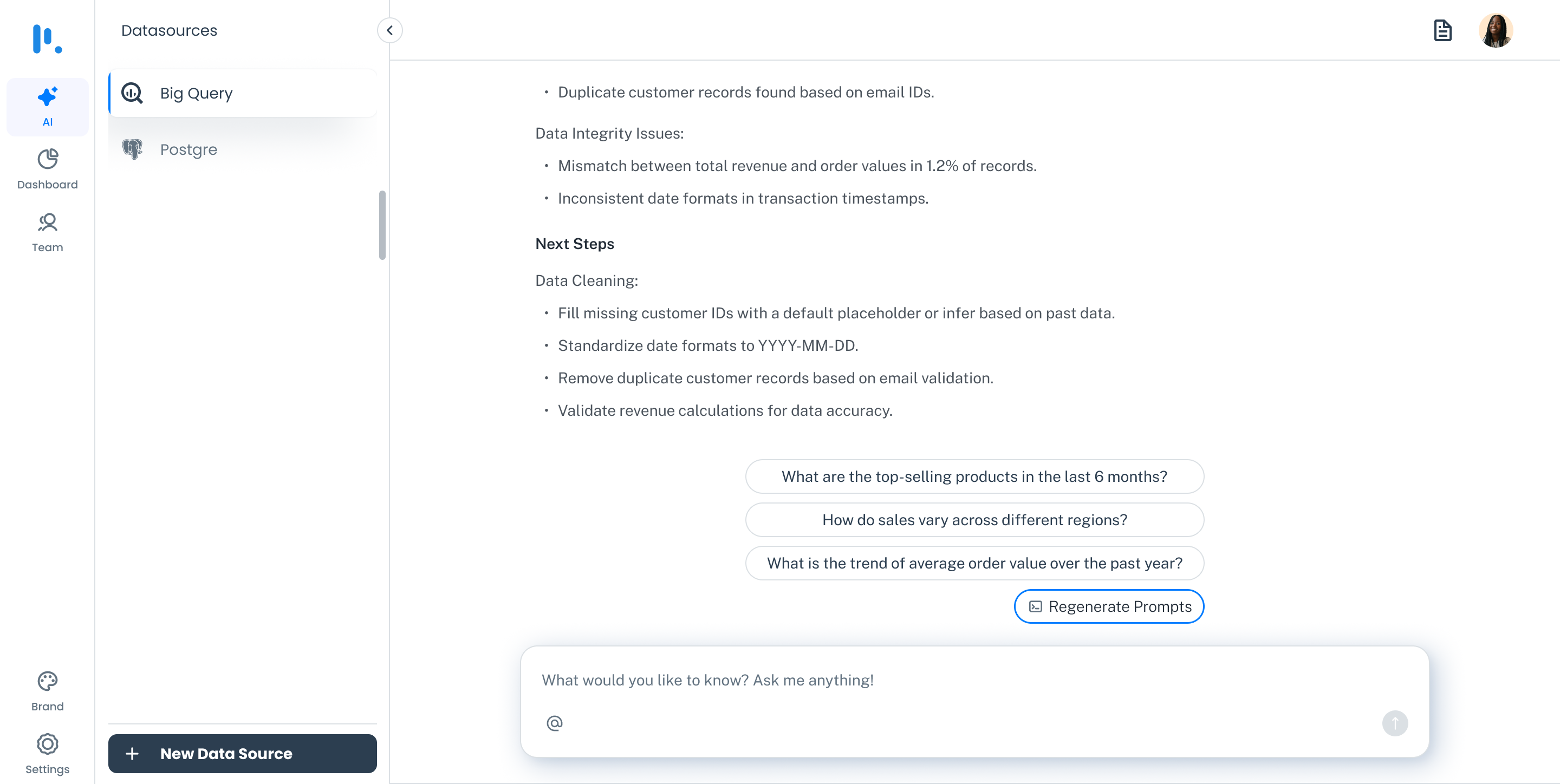
Ask questions in plain language — smart suggestions guide the way
Once Prompt BI generates an insight, it doesn't just display results — it makes them useful. Every response comes in both a visual chart and a summary format, giving users a clear understanding of their query.
Switch chart types — bar, line, pie, table, whatever fits the data best
Pin to dashboard — save important insights to review and share later
Share with teammates — directly from the result
Edit the query — refine and re-run without starting over
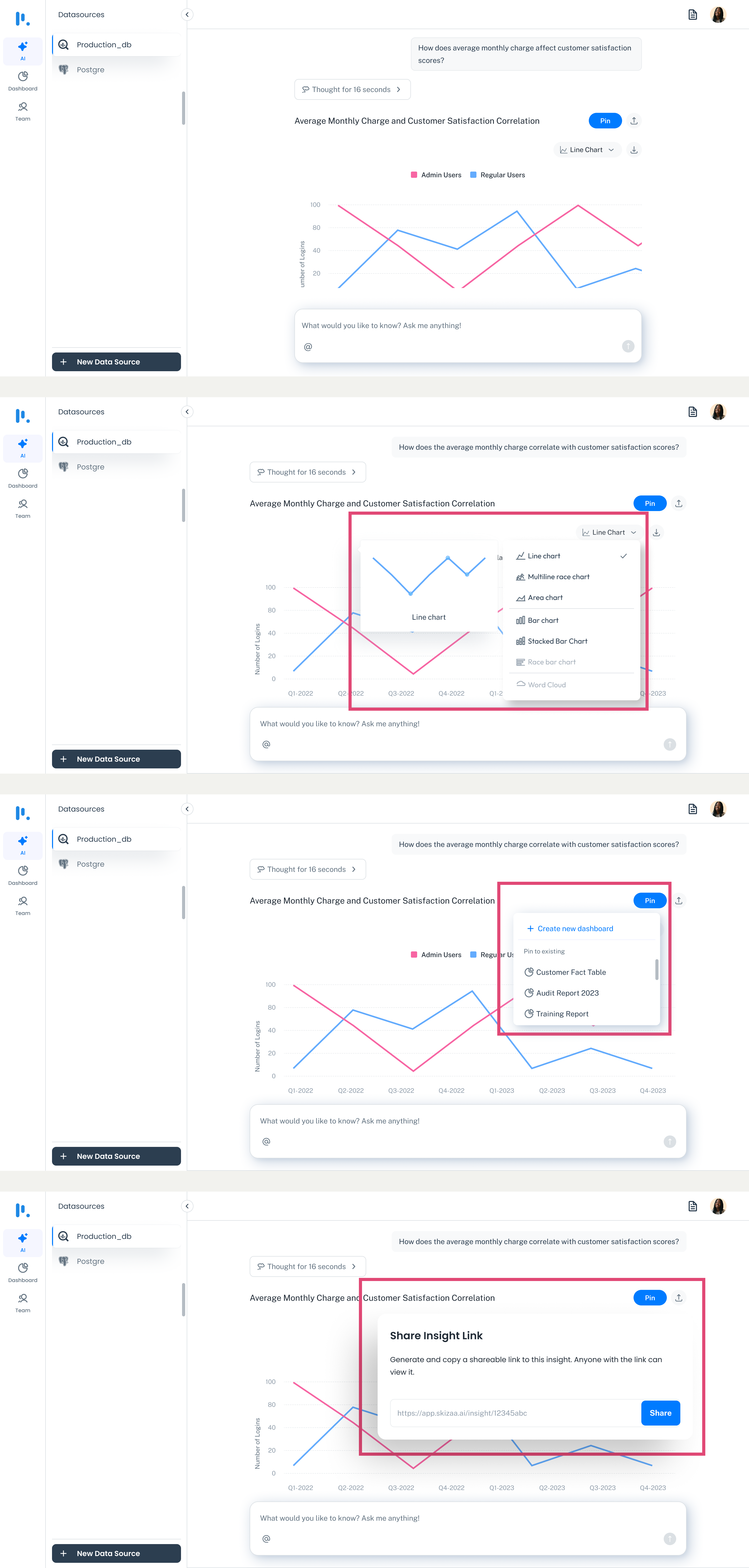
Every insight is actionable — pin, share, download, or refine
Sometimes things go wrong — a file has no headers, or two tables don't match. Prompt BI guides users with clear, friendly messages and smart suggestions to fix the issue. No dead ends, no technical jargon.
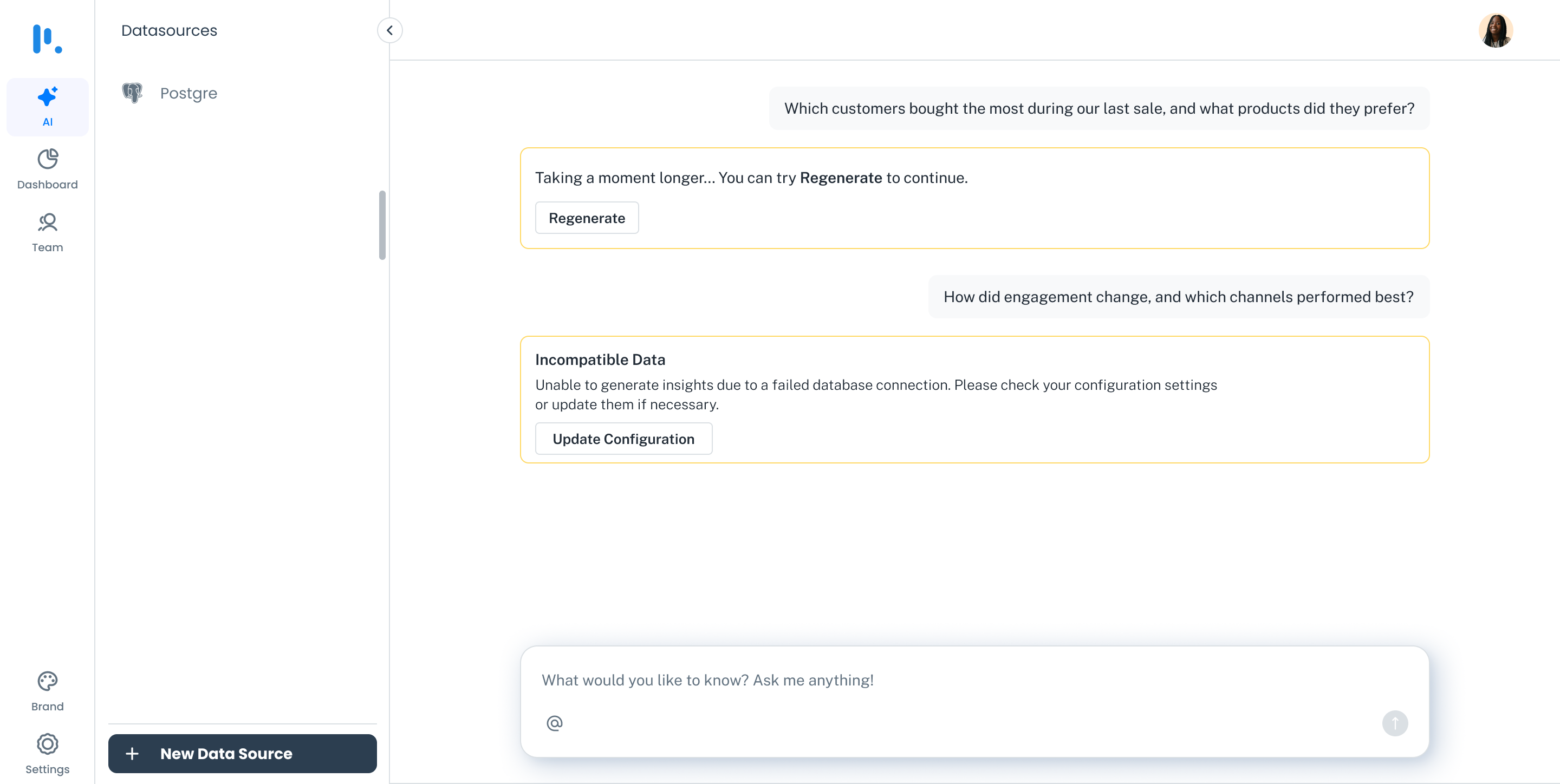
Clear errors, not dead ends
Pinning an insight is just the beginning. The dashboard is where everything users saved starts working together — not just a grid of charts, but a living view of what matters.
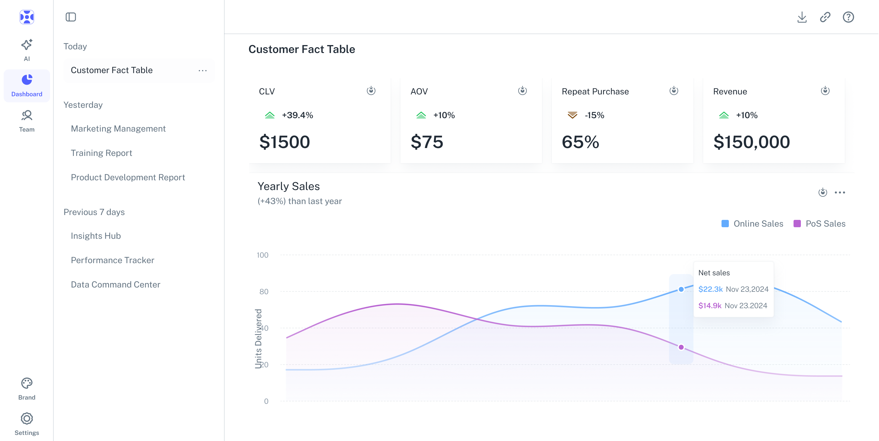
The dashboard — pinned insights working together
Saved insights unlock full customisation: edit chart types, adjust colour schemes, change labels, match branding. The dashboard grows with the user — from a quick personal view to a polished team report.
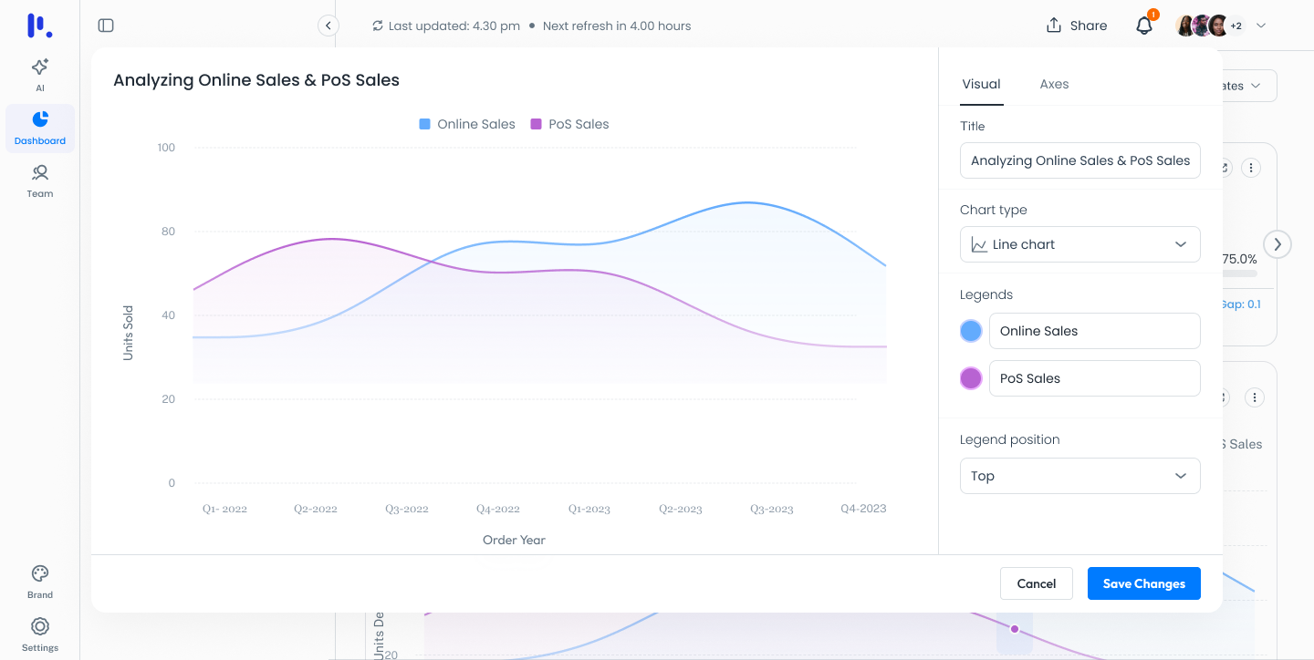
Full control over how insights look and feel
Charts aren't just for viewing — they're made for exploring. Click into any visualisation to reveal the underlying data. Share dashboards with teams, download in multiple formats, or copy insights for external use. Auto-update settings keep all visuals fresh with the latest data — no manual refresh needed.
Key Design Decision
Auto-update settings were designed to be set-and-forget. Users shouldn't have to remember to refresh a dashboard. The data should always reflect reality — removing one more reason to distrust the numbers.
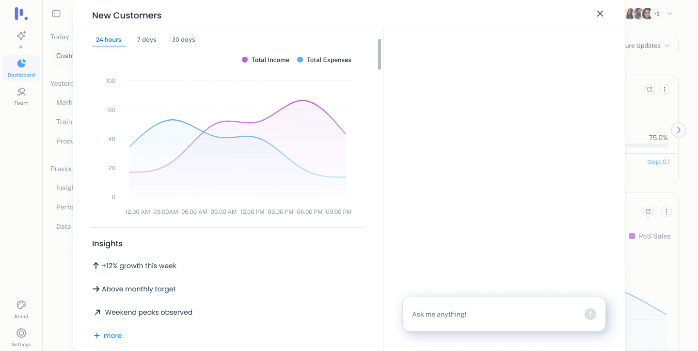
Drill into any chart to see what's behind the numbers
Prompt BI taught me that the hardest design problem wasn't the query interface — it was the transition between the two parts. Users needed to feel like pinning an insight was worthwhile before they ever saw the dashboard. So the dashboard had to be previewed earlier in the flow, as a destination worth building toward.
Looking ahead: more customisations for data previews, support for JSON and XML file formats, and integrations with platforms like Shopify and WooCommerce — to bring more users to their data, without needing a data team.